Blog

  • Signs and blunders: legibility and the marquee on the church front lawn

    Like Mark Pilgrim, I too live in Apex, NC; “the peak of good living.” I know this because that message is proudly and conspicuously displayed on both water towers. A lesson in good old fashioned marketing if ever there were one: make it large enough and simple enough so someone driving by can read it.

    Too bad not every church here in ‘the land of only one recent industrial fire‘ has yet to market the URL for their church website in a similar fashion via the obligatory marquee/sign that adorns their front lawn.

    Two cases in contrast – each taken at about the same distance one would see it approaching at the stated speed limit of their respective roads – both shown in the best daylight conditions possible:

    Calvary Chapel Cary

    Prince of Peace Episcopal Church

    As one can quickly see, the “living art project” for Calvary Chapel Cary looks great from a design perspective … but isn’t nearly as easy to read and memorize at 40mph as more utilitarian offering by the Prince of Peace Episcopal Church.

    Cleverly, the second church is using the simpler TPOP.org – an easy to render, see and remember url – as a redirect that’s more memorable when spoken “thePrinceOfPeace.org.”

    Too bad the website for “TPOP” isn’t nearly as carefully crafted and informative as the offering from Calvary Chapel.

    None-the-less, the point here is to get you to get you away from the computer for a few moments to consider how legible and memorable your hard copy URL is rendered.

  • Is your church website little more than brochureware?

     Little image of little brochure with little contentThe WikiPedia defines brochureware as: “A brochureware website is a business website that has very infrequently updated content, and little of it. Often the site has been developed as a direct translation of existing printed promotional materials, hence the name.

    Note the emphasis, that’s mine.

    This is because I’ve run into more than one church website that is nothing more than a big-honking Adobe PDF file – or worse, a big-honking graphic file – that is in fact nothing more than an online version of their printed brochure.

    The same WikiPedia article asserts “Brochureware sites therefore take little advantage of the capabilities of the web that are missing in printed publication. Often the only hyperlinks on the site are in the site’s navigation menu.

    Note again the emphasis, also mine.

    This is because most who use the web are seeking – and expect – online more than what is available in a printed brochure.

    Here are a few questions you can ask yourself and/or your church webmaster to see if your site falls into the category of brochureware:

    • Is the website designed around an existing printed brochure?
    • Does the website heavily employ PDF or graphic files to represent text?
    • Is the content on your website generally dynamic or static in nature?
    • Is the church website nothing more than one-big-honking brain-dump page created out of Word?
    • Does the church website have a usable search feature?
    • Is your church website rendered with Microsoft FrontPage or Microsoft Publisher?

    If you can answer yes to ANY of these questions, then your church website may be in part or in whole brochureware.

    Here are some past examples and topics on this topic:

    I’m sure some of you can think of some other traits and/or articles related to the topic. If so, leave a comment – in love – so we can all learn from it.

  • When web page creation tools and novice church website design collide

    One of the good things about the Web in 2008 is the number of free and easy web page creation tools to aid those novices involved in church website design. One of the bad things about the Web in 2008 is the number of free and easy web page creation tools novices employ to generate unusually unusable church websites.

    Case in point, Sabbath Day Church of God Hot Springs Arkansas, brought to you by Web Page Maker V2; a web page generation tool described on its own website as:

    … an easy-to-use web page editor that allows you to create and upload web pages in minutes without knowing HTML. Simply drag and drop objects onto the page and position them freely in the layout.

    It also appears that it is an easy-to-use web page editor that allows you to create web pages in minutes without knowing usable interface design, conversion goals, semantic HTML, and other important details. Basically, all the bad things one gets with FrontPage at only a 1/3rd the expense of FrontPage.

    That said, here are 5 things I would do to improve the web presence for the Sabbath Day Church of God:

    1. Since there is information provided on a weekly basis, consider using a blog as a content management tool. It’ll help both better organize and present otherwise compelling content.
    2. Move the prayer list page behind a password protected area – as the current format may expose the church to some unwanted privacy concerns.
    3. Lose the Java Applets – such counters are not needed in a day and age of far better usage measurement tools as Google Analytics. Such counters also slows down the page load ALOT.
    4. Optimize those bloated images.
    5. Lose the grainy-green background image – it makes the black text entirely unreadable.

    There are other things I might do as well, perhaps leverage Google Calendars and Google Maps instead of the current calendar and map solutions.

    I most definately would put the phone number, location, along with the dates and times of the services in a far more conspicuous place then hiding said lamp under a bowl as is currently the case.

    Other observations? You know the drill, leave a comment – in love – so we can all learn from it.

  • Top 10 Church Website Design Mistakes of 2007

    It is the last day of 2007, so like every great media outlet I figured why not go through the archives and come up with a list of those topics that produced the deepest and most memorable mental scars. Below is my list of the top ten mistakes I’ve seen on church websites over the past year.

    Mistakes I would hope that as a body we would resolve to remedy, though I suspect like most new year’s resolutions are destined for abandonment by about the 14th of February.

    So with limited commercial interruption, I offer Mean Dean’s Top 10 Church Website Design Mistakes of 2007:

    1. Believing you are your user:

      Unless you’re writing a church website for a bunch of blogging pastors, frustrated graphic artists and/or “… burned out computer geeks, your user isn’t you. … This is very hard to get through somebody’s head; it’s very hard to get rid of this notion that what you like your user is going to like… Again, your user is not you.”

      For the most part, people aren’t seeking the church experience online – rather they are shopping online for a real-world church experience. Those church webmasters that fail to realize this, fail to realize the full potential of their church website.

    2. Flashination:

      Flashination is a term I give to (church) websites that seem to be overly fascinated with Macromedia/Adobe Flash. What many church web servants fail to realize is that “.. fancy media on websites typically fails user testing …” at least according to Jakob Nielsen’s recent AlertBox entitled “Low-End Media for User Empowerment.”

      Where I see Flashination most often is on banners, headers, and home pages of church websites – usually in the form of scrolling images from the Church. A visual effect that is cool precisely ONCE and from then on becomes a bandwidth consuming annoyance.

      In response, allow me to quote some sage advice from Dr. Nielsen who wrote in his 1996 ‘Original Top Ten Mistakes in Web Design:’

      Never include page elements that move incessantly. Moving images have an overpowering effect on the human peripheral vision. A web page should not emulate Times Square in New York City in its constant attack on the human senses: give your user some peace and quiet to actually read the text!

    3. Church-speak:

      Without getting into a raging debate over speaking in tongues, those in charge of getting out their church’s message need to understand that, at least in the U.S., 1 in 3 adults is unchurched. Meaning 1 in 3 adults don’t understand the church-speak that ‘bables-up‘ scribed in expensive color brochures, sermon videos and web sites.

      Fact is, the church website isn’t about offering online brochureware nor a meas to show how cool a computer geek you are. The purpose of your church web page design is to convey the Christ that is in your congregation to the World by addressing the needs of seekers and members … AND by disciplining the same with the solid food of the Gospel.

      If you do both these things then I can guarantee that you will not have to spend $5k on a Search Engine Optimization (SEO) expert, nor will you have to worry about justifying your church’s online marketing expenditures.

    4. Turning your Homepage into a Splash Page:

      What does it profit your church or charity’s website to have the most beautiful web pages ever designed if it doesn’t convince people to visit your church, engage in your ministries, or at least inquire for more information? Yet more and more often I review a graphically and technically impressive church website that is more an art project than effective ministry tool.

      In the worse cases, the home page has become such as testament to the web designers Flash and CSS skills that the home page loses its effectiveness as an introductory and central point of navigation – degrading into a sometimes technically adept and entertaining splash page.

      And if you don’t know what’s wrong with having a splash page – regardless of the webmaster’s displayed technical prowess – then we need to have a long email correspondence.

    5. Thinking you’re Spurgeon:

      There is something to be said about Shakespeare’s oft-quoted assertion from Hamlet:

      … brevity is the soul of wit …

      Or as usability expert Jakob Nielsen writes his 1997 post entitled “how people read the web:”

      People rarely read Web pages word by word; instead, they scan the page, picking out individual words and sentences. In research on how people read websites we found that 79 percent of our test users always scanned any new page they came across; only 16 percent read word-by-word.

      Or as I say in my post “George Orwell: 12 blogging tips:”

      If all else fails, just remember this tried and true adage: “You’re not Spurgeon, quit trying to write like him.”

    6. Image Bloat:

      The <img> tag in HTML should be treated with the same suspicion one glowers upon all those slickly packaged low-cal cookies we see in the diet food aisle of the grocer. Both promise to avoid a glutton’s guilt – but in both cases it smoke and mirrors, leaving you feeling bloated and sluggish.

      One of the most perpetuated sins of church web design is image bloat – most often perpetrated in the form of thinking that somehow, the height and width argument of the <img> tag somehow magically and physically shrinks an image file. It doesn’t – it only appears that way. Or in in the immortal words of usability and marketing guru, Vincent Flanders who wrote in his Father Flanders’ Sermon for Sunday, July 13, 2003:

      Just because Jesus miraculously turned water into wine doesn’t mean he can miraculously turn your 1280- x 1024-pixel image whose file size is 1.8Mb into an image whose file size is only 74Kb just because you changed the WIDTH= and HEIGHT= attributes to WIDTH=”420″ and HEIGHT=”336″.

      This mistake is so common that it’s beginning to be as annoying to me as the confessions of the students of the young men of my Jesuit high school were to Father Ambrose “For your penance say three Hail Mary’s” Forsthoefel.

      In English, just because I write: <img xsrc=”mychurch.jpg” height=”160” width=”240”> does not magically or physically make my 920k image posted straight from my brand-spankin’ new digital camera load like a 20k image. Instead it means I make a page that should load in about 8 seconds take 188 seconds!

    7. Using Religion is a ‘Chruch:’

      We all know know at least one atheist, agnostic or skeptic who boldly (and often blindly) asserts religion is a crutch. Much in part due to the overbearing legalism and spiritual abuse that goes on in a minority of cases.
      That said, I it is my prayer that the Church on the whole prove these individuals wrong, not only with Christian love and charity, but also with correctly spelled <title> and <header> tags.

      Especially those whose message is unintentionally geared at a dyslexic demographic with typos such as “baptsit chruch.”

    8. Missing the usual suspects:

      Let me translate the above point for those of you who still think a long animated Flash splash page leading to a huge image of your church’s empty parking lot is the way to go … more and more individuals shop for church homes online, the greater the risk your church runs into never seeing them visit if your church website sucks!

      Yeah, pretty brutal – but enough of the ‘meme’ that God content is important, that aesthetics aren’t important. In other words solve their problems; don’t show off your fancy-schmancy solutions. Solving their needs is as simple and common sense as making the following information easy to find, read and render in print:

      • Church denomination
      • Geographic location
      • Days and times of services and studies
      • What stuff you have for their kids
      • Example sermons that show you’re not some slathering cult
      • Smiling, inviting faces instead of stony facades
      • Email contact
      • Phone number

      Yeah, you’d think the above list is obvious … but don’t get me started.

    9. Using graphics for text:

      What does it profit a charity to have the coolest web site design of all time if it can’t be found via a simple, context-related search on Google or Yahoo?

      That’s what you bargain for when you opt to use an image file, a Java applet or Flash to render the title and slogan of your church and/or charity website.

      A situation made much worse by those who go one step further and render their menu navigation using the same bandwidth busting technologies – in the day and age of CSS.

    10. Games, Gimmicks and Gizmos:

      I don’t know about you, but to me the Cross is an ‘emblem suffering and shame,‘ which is why I find the spinning animated version of it so offensive. It not only trivializes what happened to our Lord on that painful day, but it also makes your church website look cheap.

      So do ’special effects’ such as cursor trailers, pop-up windows, scrolling marquees and Flash-intros. Yes, they may look slick the first time and all your geek buddies will think you’re cool, but such contrivances quickly become annoying hindrances to individuals who are actually in need of some compelling content.

      Don’t get me wrong – don’t be afraid to use various technologies, just make sure there is a legitimate need.

      rule of thumb #4: Just because you can, doesn’t mean you should.

      rule of thumb 4.a.: you’re not allowed to have a spinning gif of a gold lamé cross on your website unless you have the same atop the roof of your church!

    And we’re done. I’m sure some will disagree, and that’s fine – some will add to the list, and that’s fine too. Just remember if you leave a comment, leave it in love so we can all benefit and learn from it.

    Now go out there and have yourself a great 2008!

  • 12 Days of Jesus Junk – Day 12 – Santa with Baby Jesus Nativity(ies)

    On the 12th day of Kitschmas my webmaster brought to me: 12 Santa with Jesus figurines.

    You betcha I ain’t kiddin’! I mean,what better way to convey to the kiddies the true meaning of Christmas in our current entertainint-driven culture than with the rotund, non-fasting, Nordic image of Saint Nicholas looking over a WonderBread white baby Jesus?

    A confusing little mixed-metaphor dontcha’ think? I do. I also think this mix of Madison Avenue imagery with legal historic details is an excellent object lesson in why we need to be careful about semantics in a different light: semantic HTML.

    For example, below is list of Santa with Jesus Nativity images I discovered in about 2 minutes on the web. In the past, one might use a <table> tag to render this list … but since IT IS a list of images and descriptions … why not use a list-like entity where the markup gives search engines, visually impaired seekers, and other systems and users a clue about the content in which they’re about to receive?

    That is, why not use a definition list to render a list of images and their associated ‘defining’ descriptions (with typos included from the cited websites)?


    Dona Gelsinger Christmas Miracle Collectible Angel Figurine
    Dona Gelsinger Christmas Miracle Collectible Angel Figurine: Rejoice! The beloved work of renowned artist Dona Gelsinger comes to life in this collectible Santa and angel Nativity figurine, depicting Santa and a pretty little angel worshipping at the blessed birth of the Baby Jesus. A sweet lamb and bunnies join in the miracle, making this special collectible Christmas decoration an even more adorable treasure for your holiday home!
    Santa with Baby Jesus figurine
    Santa with Baby Jesus Stand: This Santa with Baby Jesus stand combines two important symbols of Christmas, Our Lord Jesus and Santa Clause.Enjoy this tall and cheerful statue with Santa holding the Star of Christmas and the Baby Jesus.This is an absolutely stunning figurine of Sants in his dark red clothing with white fur trim, holding Baby Jesus who is wrapped in a blanket. This Santa is made of Resin and stands 11 1/2″ H.
    The Greatest Gift Of All Figurine
    The Greatest Gift Of All Figurine: Elevate your Christmas display to a whole new level of sophistication and beauty with this elegant Christmas collectible figurine. This lovely Christ Child and Santa Claus figurine is beautifully sculpted and carefully hand-painted in resin, highlighting the poignant expression on Santa’s face as he kneels next to the smiling Baby Jesus’ manger. Real fabrics, molded and shaped by hand, are featured on Santa’s “fur”-trimmed coat and the Christ Child’s swaddling clothes.
    Roman Santa Kneeling W/ Baby Jesus Ornament
    Roman Santa Kneeling W/ Baby Jesus Ornament: Roman Santa Kneeling W/ Baby Jesus Ornament – This stone resin ornament is a licensed Roman item, has a very special message that can be taught to children and adults alike for generations to come. The message is that Christmas is not all about Sanata Claus, but rather Santa Claus also humbles himself before his maker, Jesus. Comes in attractive gift box, measures 2 1/2″
    Santa & The Christ Child figurine
    Santa & The Christ Child: There is no greater joy than watching a baby’s face at his or her first Christmas. The excitement and happiness parents feel are contagious and surely their child is not immune to the love surrounding this holy holiday. It is only fitting then, that the gentle gift bringer, Santa, comes to visit the greatest Bringer of hope, love and peace: the little Baby Jesus. As the Baby’s face lights upon seeing Santa’s gift, a cuddly teddy bear complete with big red bow, his hand reaches up to accept the precious gift. Santa’s eyes glisten as he sees the sweetness and beauty of the Baby Jesus, who, though nestled in His humble bed of straw, bears all the dignity and power of a King.

    Blech!

    For more on how and why semantic HTML makes more sense than the usual “code slung like hash” I suggest reading my recent post entitled: Enough with the Bread and BReakfast markup already!

    For those on how and why the semantics of how and why imagery of the Coca-Cola Claus and the Uber Caucasion Christ may be sending the wrong message, may I suggest a post on the Colossians Three Sixteen blog entitled: Everybody Loves Santa Jesus!

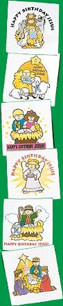
  • 12 Days of Jesus Junk – Day 11 – Happy Birthday Jesus Tattoos

    12 Days of Jesus Junk - day 11 - Happy Birthday Jesus tattoosOn the 11th day of Christmas my webmaster rubbed on me – 11 “Happy Birthday Jesus” tattoos!

    Just when you thought I’ve already cited and objectifried the worst in Kristshun Kitsch, the crass world of commercialization, like a good rash, provides the gifts that keep giving.

    In this case it’s we’re talking “Happy Birthday Jesus” Tattoos. Yes folks, everyone knows your kids will love wearing these faith-based tattoos! Easy to apply and remove, they’re fun to find in Sunday School goody bags and Christmas stockings. So what if you send your children a mixed message later in the year when teaching Leviticus 19:28?

    Which brings us to today’s object lesson, 11 blogging mistakes pastors & laypersons should avoid.

    Yes, like the overzealous but ignorant Sunday school teacher who means well  rewarding their students with rub-on body markings, so too is sometimes true when an equally well meaning pastor takes over a church blog.

    The result is a series of errors that plague most new to blogging, including the following:

    1. Getting hung up on high-tech instead of compelling content;
    2. Assuming Google will do all of your site’s ‘networking’ and ‘advertising’ for you;
    3. Shoot-off-mouth first, ask questions later;
    4. Shotgun topics – too many points (pellets) in one post;
    5. Anemic headlines that have no zing;
    6. Ignored or devalued commenters and their input;
    7. Shotgun categories – not taking control of your niche of expertise;
    8. Assumed it would be easy;
    9. An ugly URL that is hard to remember (lest spell)
    10. Know-it-all-itis
    11. poorly constructed excerpts and/or lead paragraphs.

    Three things I keep repeating here, and will continue to repeat:

    • People don’t read the web, they scan it;
    • Aggregators and search engines index and list titles and excerpts (or lead paragraphs where excerpts aren’t present) – write to that;
    • We cannot serve two (or more) masters – write to a single topic, if you have more, post more tomorrow.

    Bottom line, just it is our job to leave a mark on the World, not to be marked by worldlinesses – so too it’s our job to leave our mark online with our writing, rather than merely splatter senseless, non compelling markup just so you’re different like everyone else.

  • 12 Days of Jesus Junk – Day 10 – Moses Action Figure

    12 days of Jesus Junk - day 10 - Moses Action FigureOn the 10th day of kitschmas my webmaster threw down on me – 10 Moses Action Figures (all clutching tablets of the 10 commandments in their patented kung-fu grip!).
    Seriously, todays wandering into ‘Wadi Crapola‘ was made a bit amusing by some of the descriptions given for this particular item. Of note:

    Recreate theTen Commandments with this 5 1/4″ hard plastic Moses Action Figure. It has moving arms and legs, as well as removeable shepherd’s staff and stone tablets. Moses info on the package too! – Giftoplois

    A description that is only topped by this one:

    The story of Moses has more action than a James Bond movie. Miracles, murder, plagues, escape, betrayal – his life was filled with dramatic events and exciting adventures. With our 5-1/4″ tall, hard plastic Moses Action Figure you can recreate the entire epic saga in the comfort of your own home.

    Use the removeable shepherd’s staff and stone tablets to punish your roommate with God’s plagues or deliver the Ten Commandments to your little green army men. Comes with interesting Moses info on the back of his card. – StageFight.com

    For me however, I’d suggest buying this Torah Toy as an object lesson in … wait for it …

    … a reminder to read my classic article entitled:

    Here are the first three just to whet your whistle:

    1. You shall have no text other than your church’s name, denomination, city and state correctly spelled in between the <title> tags of your church’s home page.
    2. You shall not make for your self webpage description and keywords meta tags that contain key words that are not related to your church’s ministries, purpose and personality.
    3. You shall have no text other than your church’s name, denomination, city and state correctly spelled in between the <h1> tag in the header of your church’s home page – even if you are using some form of CSS text/image replacement.

    Now go be doers of the word, rather than mere readers!

  • 12 Days of Jesus Junk – Day 9 – 9″ Plush Long Arm Religious Gorillas

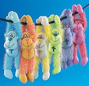
    9 inch Plush Long Arm Religious GorillasOn the 9th day of Christmas my webmaster gave to me, a 9″ Plush Long Arm Religious Gorilla!

    Oh how I wish I were making this one up today. I mean talk about a John 11:35 moment – what in the name of all that’s Christmas does a day-glow colored gorilla have to do with anything related to the birth, life and death of our Savior?

    That said, I think the colorful string of hominidae hangers do at least offer us an excellent object lesson to those new to church website design:

    Don’t go ape over new technologies just for the sake of implementing them!

    Here are 9 wretched examples, from memory, I’ve encountered where the church webmaster made a monkey out of their website with some new gizmo or gadget they encountered:

    1. gratuitous flash animations & navigation
    2. cursed cursor trailers
    3. spinning animated crosses
    4. page swipes & animated marquees
    5. dhtml snowflakes drifting down the screen
    6. pop-up and pop-under windows
    7. cursed cursor trailers
    8. disabled right-click
    9. rainbow colored dividers & title text

    Please don’t do this. Yes they effects are all cool … for about the first five seconds, after that, they tend to drive your users away.

    Remember, just because you can, doesn’t mean you should. That is, don’t be afraid to use various technologies, just make sure there is a legitimate need.