Category: Conversion Goals

  • 10 Things an Effective Church Website can do for You

    As I peruse the great cloud of witlessness that is the Body online, I find one of the primary problems afflicting many sites is vision. That is I often find those responsible for delivering the goods don’t really see their site as much more than an online color brochure. As a result, more often than not, very little staff and/or funds are allocated to the church’s web presence past the server, the domain name and perhaps a content management service.

    In no particular order, I’d like to offer 10 real-world examples you can expand your church and/or charity’s impact by expanding your vision past mere ‘brochureware.’ A list that perhaps will come in useful the next time individuals in the ways and means committee seek to slash your web site’s funding.

    1. Reach New Residents

      I actually like new resident door hanger campaigns, especially those that offer a slice of pie and/or a free Wednesday night dinner. An ideas I got from my last church who had such a program entitled ‘People Involved in Evangelism’ or P.I.E. … hmmmm … pie …. but I digress.

      Having a well-indexed, search-engine friendly website goes one step further in bringing those new residents to your doorstep … in some cases, even before they move to town.

    2. Convert Seekers

      Perhaps one the strongest arguments I can make for providing the text of your sermons online is how such materials can draw-in those seeking God’s answers to life’s questions.

      Even in cases where said individual came in casually and unintentionally through something of relevance that caught their eye while primarily searching for something else.

    3. Build the Body Online

      By adopting a blog-centric approach to sermons and events you can easily and electronically inform the right hand of what the left hand is doing; and visa-versa.

    4. Maximize Press and Ad Campaigns

      Sometimes you only have a six second soundbite to get your church’s name, slogan and/or domain out into a newspaper, magazine or radio station.

      In those cases, leverage your website to provide all the additional fun, times, maps & directions, costs and pictures that can’t be printed in a single line of newsprint.

    5. Save on Printing and Postage

      By utilizing email lists, RSS deeds and other online tools, your church and/or charity can become better stewards of congregational contributions by dispensing such information online.

    6. Minimize Dead Ends

      By having an informative and complete church website that clearly represents your organization’s purpose and personality – you can reduce and/or eliminate time spent on leads whose interests are better served within the arms of some other congregation.

    7. Communicate Across Boundaries

      By taking advantage of both an effective website and a variety of web-based office and/or presentation applications – boundaries such as differing operating systems and/or geography are easily overcome.

      Similarly, there are mind-mapping and crowdsourcing tools that can be leveraged to encourage thinking that’s not only outside-the-box, but also doesn’t all have to happen within the 4 walls of your brick-n-mortar buildings.

    8. Reduce Staff Support Loads

      While I believe that every church website should make it easy and inviting to call anytime – having an up-to-date calendar of events can help minimize the number of ‘just calling to are what time it starts’ calls that can nickle and dime away your church staff’s effective work hours.

    9. Support Lay Ministries

      Consider utilizing class curriculum tools such as Moodle to support Bible studies. Along with that, give that hard-working 20% a break from having to physically attend each and every meeting by using cool communication tools such as WiPeer to hold web-based meetings and/or webinars.

    10. Gauge Relevant Interests

      By implementing and monitoring statistical tools such as google analytics and the now free FeedBurner you can track which aspects of your church website are effective and which require a but more healing.

      I’d also suggest adding a separate site tracking mechanism to content-rich areas of your website so you can easily which sermons and/or Bible studies are hot versus those that are not.

    Point isn’t to freak-out already overwhelmed church webmasters, pastors and laypersons by enumerating all the things your church website doesn’t have …

    … but rather to get churches and ministries of all sizes to realize that our ministries have been provided several new tools over the past couple of years that properly leveraged can enhance our efforts and enable our volunteers to better fulfill the Great Commission to which we are all called.

    Agree? Disagree? Leave a comment in love.
  • Pastors, programmers & graphic artists listen up: your user isn’t you

    Unless you’re writing a church website for a bunch of blogging pastors, frustrated graphic artists and/or “… burned out computer geeks, your user isn’t you. … This is very hard to get through somebody’s head; it’s very hard to get rid of this notion that what you like your user is going to like… Again, your user is not you.”

    Please pardon my blatant rip-off of Deborah Hartmann’s quote of David S. Platt’s recent keynote entitled “Why Software Sucks.”

    Perhaps it is 30 hours of planes and airports traveling back from Kuala Lumpur that’s made me a bit grumpy. Perhaps it is the head-cold inflicted on me by the sick six year old who kicked my right side most of the way home. Or perhaps it’s just the continual parade of church websites that suck that has me annoyed at the great cloud of witlessness that is the Church online.

    Probably a bit of all three. None-the-less, there’s a simple truth that I think to many of us are missing when it comes to designing and maintaining our church and charity websites which I’m hoping gets quoted and discussed web-wide:

    For the most part, people aren’t seeking the church experience online – rather they are shopping online for a real-world church experience.” – Dean Peters, HealYourChurchWebSite.com, 16Sep07.

    Agree or disagree, I’d like this meme mulled-over in as many places as possible – and along with it, the following 5 suggestions to make your church website work, based on David Platt’s 5 suggestions to ” Just Make It Work:”

    1. Add a novice to the design team: I’m thinking a silver-haired seasoned citizen as they are often overlooked, yet comprise a significant population of any church body.
    2. Break convention when needed: Quit thinking brochureware (print marketing) and/or writing like Spurgeon – the web is different.
    3. Avoid feature “silliness”: Your website isn’t a stinkin’ art project, so cool it with the cheap tricks.
    4. Instrument your application very carefully: again I’m thinking silver-haired seasoned citizen and other members of the “silent majority” who may not be geeky cool, but are the ones who need an effective church website the most.
    5. Consider whether design decisions are taking you closer or farther away from the software *just* working: this implies you have a clear understanding of what it is your church and/or charity website is trying to accomplish. Meaning, I’d document some use cases.

    In the meantime, I’m going to work on some articles this coming week to detail some simple procedures that will take your church website from cool and unused, to effective and often implemented.

    As always, your comments, questions and concerns are always welcome.

  • 5 tips for blogging sermons effectively

    Just publishing your sermon notes to your church’s blog is not enough – not if you want anyone to actually read them. Here are five simple things you can do to make your sermon notes more visible to more readers through more search engines.

    Why this is important:

    Ah sermons … the holy grail of any church website … not only because they provide church webmasters with a source of dynamic and (hopefully) compelling content, but because the (hopefully) compelling content serves seekers and members alike.

    Problem is, many sermons online go unread because they’re posted “as-is” rather than following these five simple steps that will (hopefully) increase their visibility on various search engines – especially Google:

    1. Put your key content on top

      Search engines index by title, so if you have some key words that represent your key points, put them in the title of your post – even if it is slightly different than the title of last Sunday’s sermon.

      Search engines display excerpts after the title – so help your readers out by putting your key points in those first 128 words or so.

    2. Lose the church-speak

      Don’t compel those not familiar with the vernacular of your congregation to have to learn a dialect of ancient Greek just to figure out what you’re saying.

      Likewise, avoid kitschy clichés and internal acronyms – they’re lost on first time visitors.

    3. Focus on what benefits the reader

      Rather than beating the faithful, make sure your titles and excerpts provide a “what’s in it for me” moment – so that the seeker is encourage to read the rest of the sermon, rather than click on over to CNN.
      For example, instead of:

      • title: Seven Deadly Sins
        excerpt: Seven reasons the World is going to hell in a hand basket

      Try:

      • title: The Wisdom of Proverb 6
        excerpt: 7 things you can control to life better now and hereafter.
    4. Write inviting titles

      Write titles that make people hunger for more.
      For example, instead of:

      • This sermon will discuss the fruits of the spirit, how they effect you, and what you should do.

      Try:

      • 9 yummy fruits of the spirit to nourish your walk
    5. Enjoy the art of the subtitle

      For example, instead of simply:

      • Daniel 3:1-30

      Try:

      • Daniel 3: Nebuchadnezzar’s epiphany at the fiery furnace door

    Here’s the best part of the above – while I demonstrated changes in titles – I did so without compromising on the content. Same can go for you.

    And how will you know if and when you’re effectively re-factoring your sermon titles and excerpts? Simple – begin using tools such as Google’s Analytics to track not only how many visitors hit your site, but what key words they use to get there and how long they stay there when they visit.

    Such analysis will quickly provide you with the information you need to gauge just how well you’re doing when you post your sermons online – especially those of you using blogs at inexpensive content management systems for your church and/or charity organization.

  • How to (really) embed Google Maps on your church website

    I think it is safe to assume that getting people into the pews is a conversion goal most, if not all church websites share. But how are guests going to eat all the donuts and sleep through the sermons if they can’t figure out how to get there? One sure way to kill off the ‘it was hard to find’ excuse is embedding Google Maps on the directions page of your church website. Especially now as Google claims to have made embedding as easy a 1-2-3; though I personally think it takes about 10 real-world steps.

    Steps 1-4 of how to embed a google map

    Step 1:
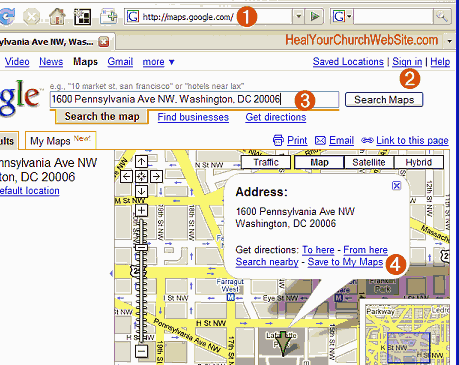
    Goto maps.google.com (phew, that was easy!-).
    Step 2:
    Login to a gmail account. Yeah, note that even though you’ve added Google aps to your church’s domain, you’ll still need a gmail account. Hopefully one that reflects the name of your church will get it done. Note to Google, how about adding maps to the aps? Please?
    Step 3:
    Now, enter in the address of your church and charity. An alternative is to enter the latitude and/or longitude (uber-geeks please take notem, that would be ‘38°53′55.55″N 77° 2′11.96″W’ in the case of my example).
    Step 4:
    Click on the “Save to My Maps” and either save to and/or create a new maps page for your organization.
    Note: you’ll be entering 2 bits of info, the overall “Map Page” and the individual marker/location. You’ll want this so you can add other addresses markers as needed, like to an off-campus outing, picnics in the park, site of new super-deluxe mega-church construction project, etc …

    step 5 of embedding a google map

    Step 5:
    Modify the description of your marker, taking advantage of the fact that you can enter hyperlinks – like to the rest of your church web site.

    steps 6 and 7 of embedding a google map

    Step 6:
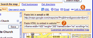
    Click on the “Link to this page” link.
    Step 7:
    Copy the stuff in the second form text field entitled “Paste HTML to embed in website” … don’t be afraid to resize the map by clicking on the ‘Customize and preview embedded map’ link – especially to make the map tall than wide to better accommodate your ‘step 5’ annotations.
    Step 8:
    Encapsulate the code in a division of your choosing for later CSS control, then either save it to an individual file that you’ll include in other pages, and/or paste it into your directions page – NOT YOUR CHURCH’s FRONT PAGE.
    Remember, this is a Ajaxy-Javascript type of thing, adding this to your front page means you potentially create delays for first time visitors, and or blank boxes if/when the service gets overloaded.
    Also, WordPress users, I might suggest using a plug-in as the editor breaks badly when embedding such iframes – unless you disable the visual editor via your user profile.
    Step 9:
    Test the map from as many different browsers as possible.
    Step 10:
    Collect metrics to see how effective this all is.

    That’s it. And heading my advice in step 8 – you can see an example of it on my website over on a separate ‘direction example‘ page I created for this mad experiment.

    Your mileage will obviously vary, so leave a comment and lemme know how it goes.

    In the meantime, some additional bloggery on the topic:

  • What to do when your homepage becomes an splash page

    What does it profit your church or charity’s website to have the most beautiful web pages ever designed if it doesn’t convince people to visit your church, engage in your ministries, or at least inquire for more information? Today I review a graphically and technically impressive church website that is more an entertaining art project than effective ministry tool.

    In an article entitled “Turning visitors into users,” Gillian Carson asserts:

    Thousands of people may be visiting your site every day, but if you don’t convince them that they should be using your product, subscribing to your service, or registering in some way, then your web app’s homepage is simply not doing its job.

    Amen sister! Point well stated, and one that immediately came to my mind when I was recently emailed a link to a church website by a talented graphic designer excited with their work. The site is beautiful to behold, displays advanced CSS and Flash techniques, and certainly the result of hours of pain-staking labor.

    Unfortunately, somewhere in the process, this art project has also functionally rendered most of the web pages into a series of eye-candy splash pages.

    Art Project versus Functionality

    I’m talking about the Northside Christian Church of New Albany, Indiana church web site (herein NCC-ws).

    Unlike most sites I review here, this labor of love obviously ‘breaks a vase’ … unfortunately it also appears to pour its contents onto the feet of potential parish participants, instead preaching to a choir of cool people. Perhaps this sentiment from Jeffrey Eisenberg, the author of “Call to Action: Secret Formulas to Improve Online Results” who writes:

    You have goals for your business. You have goals for your prospects, whether those prospects are businesses or consumers. You want them to make purchases, or subscribe, or register, or become a lead online or have your online presence compliment your offline efforts. Your goals should be reflected in your conversion rate;…

    Meaning, Christ uniquely charged the Body with the task of serving one another in our efforts to save one another through the mercy and grace of His sacrifice on the Cross. This happens when we get to know one another, and getting to know one another doesn’t happen until we meet one another many times until we understand how to serve one another.

    Hip-hop versus Classic Rock

    As someone who not to long ago himself moved to a new community – I cannot described in words the functional frustration I felt when encountering gorgeous graphic design sites such as the NCC-ws.

    IE6 Ooops on the Northside Christian Church ministries page

    Perhaps because along with alot of ‘pop’ presented also made me feel like they were calling me ‘pop’ … in the pejorative. That is that I was not young, hip nor cool enough to be part of such Christian bodies.

    Here are just some of the factors on the NCC-ws that brings me to this opinion:

    • Assumption that 1280×1024 resolution rules the roost;
    • Assumption that everyone has a high-speed connection;
    • Assumption everyone’s installation of Explorer is version 7;
    • Menus and context include quite a bit of NCC-specific church speak;
    • None of the 800×342 images on each page show anyone over age of 30;
    • Employs tiny dark gray text against black background is hard for those of us over 30 to read;
    • Home Page uses Flash-animated slide show on the home page to deliver search-engine type information;
    • Puts the most compelling content is below the fold, rendering location & service time information at the very bottom, using graphics to display text.

    There are other elements, but these are the ones that jumped out at me within the first 90 seconds … fifteen of which were spent waiting for the page to load, another 15 figuring out that there was actual context hidden below the huge, splash-page like graphics atop each page … and this only after switching browsers to accommodate the Flash animation on the home page.

    Graphic Design versus Web Development

    Considering that close to 50% of the New Albany population is over the age of 25 … I think the NCC-ws needs to reconsider it’s online approach in terms of conversion goals.

    That’s actually not going to be so hard for NCC because it’s obvious to me that there’s a talented graphic designer at work here. That said, there is also quite a bit of compelling content whose light at this time is unfortunately hidden beneath a Flash-driven basket.

    Below is a generic list of conversion goals I’d suggest the folks at NCC-ws tweak to meet the needs of their particular community:

    1. get seekers in the door
    2. get relocated visitors in the door
    3. get casual visitors to dig into the web site
    4. provide online support for lay ministries
    5. provide online support for staff ministries
    6. provide a provide a platform for congregation-wide communications

    Once these goals have been refined, I’d spend some time considering how to better highlight the large body of content that already exists. It took some time, but I found it – yet like a light hidden under a bowl – its utility was minimized by the overuse of over-sized imagery.

    I’d see if there was a way of adding sermon notes to accompany the podcasts. Not everyone has an iPod yet, let alone understand how to lock-n-load last week’s sermon via iTunes. Some compelling textual content would help such individuals understand the theology of the church, while making it much more visible to search engines than it currently is currently the case. Oh, and don’t forget to link up the RSS feeds for both those information streams.

    I think employing some more direct metaphors for essential information would help. Don’t be clever with the times of the service, rather as dull as it sounds, use an unordered list block so that information is easy to easy to cut, paste, SMS and/or print. Likewise, leverage some Google API goodness, deliverng a calendar for events, and maps for the directions page.

    The small white text against a black background is almost as unreadable as the gray menus against the black background. Be kind to us older laptop users – I know the new gamer generation is more visually oriented – but some of us still prefer printed text when it comes to making important decisions such as which church to attend.

    As for all the Flash – don’t force it on the user – rather put them in control. If the object here is to provide fresh content, do it with excerpts describing upcoming events, studies, and sermons. That said, I see a ‘graphics’ page here, so make that a place to view the ‘Animation’ of the week. Syndicate that as well.
    Finally, a bit of testing wouldn’t hurt. For example: using one of the browser testing tools I wrote about the other day, I see that the Ministries page has some issues with the still popular Microsoft Internet Explorer 6.n.

    Moreover, I’d not make the mistake of assuming I’m the user – but rather have the site functionally vetted by having members across all ages and platforms give the site a whirl. I’d implement this both in the comfort of their homes, but also by pulling some aside into a classroom one Wednesday night to observe them attempt to accomplish simple-but-common tasks associated with the site’s conversion goals.

    Additional Reading

    As always, I’m not offering these ideas in a vacuum, but rather as a result of 25 years experience and alot of reading. Here are some interesting related links I came across while putting together this post:

    Got an opinion? Don’t’ be shy. Register once, comment often!

  • Conversion Goals part ‘Duex’ – 1st impressions count!

    “It is vitally important that the first contact someone has with our church is a positive one. Andy Stanley says it this way, “Your sermon starts in the parking lot.” As more and more people begin their search for a church by looking online, the “sermon” could very well start with your church’s Web site. When I look at your church’s Web site, I can immediately tell you a lot about your church, your values, your mentality, your approach, and whether or not I’d want to be a part.” – Todd Rhoades, MondayMorningInsight.com

    Let me translate the above quote for those of you who still think a long animated Flash splash page leading to a huge image of your church’s empty parking lot is the way to go …

    … as more and more individuals shop for church homes online, the greater the risk your church runs into never seeing them visit if your church website sucks!

    Jesus saved me, the rest of you are going to h-e-double tooth picksYeah, pretty brutal – but enough of the ‘meme’ that God content is important, that aesthetics aren’t important.

    If you pull into the church parking lot and you’re greeted by a smelly, un-bathed, 3x-large individual wearing a dirty medium sized t-shirt and speedos, that the former reads in between the filth and holes reads “Jesus Saved me, the rest of you are going to H-E-Double Tooth Picks!” .. I’ll guarantee a majority of you will spend some quality family time at the local Perkins or Waffle House that morning.

    Same is true with the internet.

    If you have a web site that looks like you don’t care about their needs – then individuals seeking a new church home, or a conversion-conversion experience will go some place that does look like they care. It is that simple. Or as Rhoades writes:

    ‘Researchers in Canada have shown that the snap decisions Internet users make about the quality of a Web page have a lasting impact on their opinions. According to a nature.com article, “Web Users Judge Sites in the Blink of an Eye,” by Michael Hopkin’

    In other words solve their problems; don’t show off your fancy-schmancy solutions. Solving their needs is as simple and common sense as making the following information easy to find, read and render in print:

    • Church denomination
    • Geographic location
    • Days and times of services and studies
    • What stuff you have for their kids
    • Example sermons that show you’re not some slathering cult
    • Smiling, inviting faces instead of stony facades
    • Email contact
    • Phone number

    Yeah, you’d think the above list is obvious … but in the next few weeks, we’ll be referring back to this article as I show yet more good examples of bad church web design by well meaning webmaster type individuals who don’t have a clue as to what the conversion goals are for their cool church web site.

    Oh yeah, and a super-huge hat-tip and ‘terima kasih banyak-banyak‘ to one of my Malaysian friends: Wilful Sunflower for forwarding this article/link – keep’m coming folks!

  • Coolness does not equal conversion

    Wow, this commuter plane to JFK is freezing cold – as are attitudes by some church web masters to the needs of their congregation … and staff.

    What am I talking about? Usability and utility.

    I get quite a bit of search engine traffic along the phrase ‘coolest church website’ – a meme that bugs me a bit as I’d take useful and informative over cool anyday.

    Not so though with many sites I are cited on various compendiums of church website coolness.

    Without naming names, there I often find enumerations of sites that are more set project than a communications tool that either bestows knowledge on the local members of the body and/or drive persons into the pews, Bible studies and/or other ministries whose benefits have more permanent impact than a pretty Flash presentation.

    Mind you, this is not to suggest mediocre manifestations of HTML uglieness – we should always attempt to field high quality work – but rather the work should be geared and focused around ‘conversion’ goals. And I mean that in both the marketing and evangelical sense as both are far more measurable than cool.

    Anyway, something to consider when discussing the direction of one’s church and/or charity website.

    Bah – I hate it when these dinky commuter planes land – my ears!!!

    UPDATE – I couldn’t get this message out from my BlackBerry while at JFK, not due to anything geek, but rather because I was in a constant state of ‘sprint’ as timing between planes didn’t go exactly as planned.

    All that said, I’m now in a Malaysian Starbucks. The coffee isn’t so good – but the bandwidth is free. Tomorrow I’ll switch to tea!