Category: Conversion Goals

  • Social Media is for engaging in dialogs, not a platform to pound the pulpit!

    Dear social media friends & circles, if you use Facebook & Google+ as you would a blog, then don’t get upset if I ‘defriend’ & ‘uncircle’ you.

    A Failed Social Media Strategy

    Last night I ran out of patience with an individual on Google Plus (G+), who though they meant well, were entering a series of multi-paragraph posts on their stream, with quotes, photos and all.

    • Basically, they were treating G+ like a blog.

    As Annoying as this was on my laptop, I ignored the situation. However, spending time on my new Samsung Droid Charge, I found right flicking finger blistered beyond belief as I had to page past several screens of this user’s tomes to see what anyone else was doing.

    As soon as I ‘uncircled’ them, my GPlus mobile user experience went from ARGH to Aaaahhhh.

    I’ve had similarly ‘defriend’ some on  Facebook as well, though for the most part, only in those cases, I’ve basically start out by ‘hiding’ all posts by an overzealous associate before going with the nuclear option.

    And for what-its-worth, I make good use of gmail’s filtering capability for spammy newsletters that don’t respect the ‘unsubscribe’ option hey offer.

    So what’s in it for me?

    So what can we learn from the above kvetch-fest? Plenty, glad you asked.

    Whether you engage in social media for personal fulfillment or as part of a larger digital marketing strategy, the point of social media is to ENGAGE others IN a DIALOG.

    If you want to get all preachy and pound the pulpit and/or go all prose on your organizations next big shindig, then may I recommend some of the following tactical approachs?

    • create a killer blog post to present your idea or event;
    • give the blog post a ‘pheromone infused’ title;
    • make sure the 1st paragraph has ‘crack-like’ compelling content;
    • add #hashtags to your blog post’s tags;
    • using the above, create a magnetic 100-120 character meme/excerpt to post on Facebook, G+, Twitter, LinkedIn, etc …; and
    • now go take a look at your work on a variety of platforms (mobile, laptop, tablet, etc …), and tweak those that appear annoying, ill formatted and/or ineffective.

    Finally, and more important than any of the above — make sure to follow-up with folks who post comments, re-tweet and/or reach-out to you based on your awe-inspiring words of wisdom.

    Bottom Line

    So here’s my call to action:

    • use blogs for providing compelling content;
    • use social media to engage others in dialog;
    • develop a tactical approach that uses the right tool for the job for your digital marketing strategy; and
    • have a digital marketing strategy.

    Agree, disagree, have an opinion? Why not force me to practice what I preach and leave a comment?
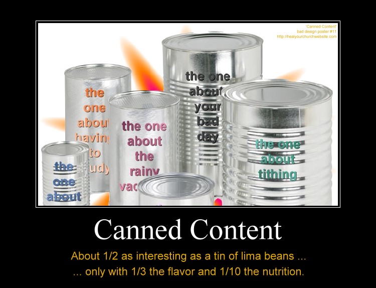
  • Bad idea design poster #11 – Canned Content

    One of the things myths I’ve heard from attending my share of  Word Camp Raleigh events is that template systems are somehow a magic bullet to a successful online marketing campaign.

    Canned Content, about 1/2 as interesting as lima beans with 1/3 the taste and 1/10 the nutrition.

    Not that there’s anything wrong with terrific tools such as  Thesis, Headway, Genesis, and Builder; nor the premium themes one can purchase for them.

    Rather I’m hoping that along with the discussion of getting a fast start with premium framework themes and plugins that we also remember what usability guru Jakob Nielsen said about ‘Information Foraging‘ back in 2003 when describing how to catch and keep visits from data hungry first time visitors:

    The two main strategies are to make your content look like a nutritious meal and signal that it’s an easy catch. These strategies must be used in combination: users will leave if the content is good but hard to find, or if it’s easy to find but offers only empty calories.

    Basically, Nielsen is detailing how to attaining user-activity goals through the careful crafting compelling content and the navigation to it – known in the web strategy/analytics world as a ‘conversion funnel.

    So it is my hope that amid discussions on how to make our blogs look  ‘different like everyone else’ via various rendering engines, that we also take some time to talk about how-to develop a sensible information architecture that best suites the goals of your church and/or charity.

    Put another way, we need to remember that if  “Web users behave like wild beasts in the jungle …,” then we probably want to avoid taunting such ‘Informavores‘  with ‘canned content’  when in fact only raw meat will satisfy their hunger.

    In other words, just because a number of the speakers are justifiably and understandably using this conference as an opportunity to sell their template and plugin wares – it shouldn’t be to the exclusion of those in attendance whom are seeking help with all the other aspects that go along with establishing an effective web presence.

    Meanwhile, if you’re headed into town, let me know. If you can’t make the event, keep in mind that there’s a “SitePoint Podcast coming to WordCamp Raleigh.”

  • 5 things we can learn from the office candy machine

    Office vending machine filled with stuff nobody wants.I just overheard a useful conversation between two vending machine operators while loading up our office junk food dispenser with a bunch of products that didn’t sell last week. It is if nothing else, an object lesson in contrast to my oft quoted aphorism “solve their problems, don’t tell them yours.” Here are 5 things we can in turn do in contrast to improve the user experience on our church and/or charity websites …
    … but first a bit of context.

    Last week I was working late, so I went to the vending machine to purchase some sugar-free Dentyne chewing gum. The machine was out – so were most the low-cal, low-carb consumables. The next day I noted the machine restocked, only the empty slots instead of offering snack solutions for my health conscious office mates, instead the replenished racks included:

    • M&M’s – plain & peanut
    • Spicy Sweet Chili flavored Doritos
    • Mrs. Freshley ‘Original’ Jumbo Honey Buns
    • Mr. Piggy Fried Pork Rinds (I’m not making this up)

    Today, while capping off my coffee cup by the adjacent caffeine delivery device, I noted two gentlemen again restocking the junk food dispenser when one of the machine operators – possibly in training – asked the other “how do you decide what to refill it with?” the other immediately replying “... with whatever I have too much of, that’s how I decide.

    No, no, no, no, NO!

    Now granted, both these individuals are likely a bit more than minimum wage employees to a large, regional vending concern, so I don’t expect them to understand what’s wrong with said answer. However, the proprietor for whom they work should – and should train and equip these hard workers with information to become smart workers – that is provide them with data sheets on what’s hot and what’s not for a given office vending machine.

    Same rules apply for our church and charity websites. Here are 5 quick ones off the top of my head:

    1. Collect useful usage data – does your site have a mechanism for collecting useful usage data? Note, I said useful usage data. There are some counters and stats services that provide little more than a “hit count,” which in today’s age of search engines, aggregators, and spammers can give lead you down a path to decision perdition by including counts of visits by automated systems not interested in filling your pews.If you don’t know where to start, may I suggest incorporating Google’s Analytics on your website. Though not real-time, at the end of the day, it does provide you with a great idea on both what humans and bots are banging away at your site.
    2. Understand where the traffic is coming from – that is understand:
      • What search engines are sending the most traffic?
      • What keywords are being used with said search engines?
      • What keywords are being used on your own website’s search tool?
      • What other websites are sending you traffic?
      • How much direct traffic is there?
      • How much traffic is being driven from email applications?
      • How much traffic is being driven from aggregators?
    3. Understand what pages are hot – and also understand why pages are not. This should be pretty straight forward, but along with asking which page gets the most visits, also ask:
      • Entry pages – which page is the first e viewed by a visitor and/or which are the pages most attracting visitors?
      • Exit pages – from which page do visitors leave the most
      • Average visit duration – what is the total length of a user’s visit?
      • Average page duration – how long are pages is viewed?
      • Top path – what is the leading sequence of pages viewed by visitors from entry to exit?
      • Bounce rate – are there pages which users leave without visiting any other pages before a specified session-timeout occurs?
      • Error messages – where is the user experiencing some level of frustration due to errors? Information which could explain your high exit/bounce rates.
    4. Understand why pages are hot – In other words, regardless of which analytics tool you use, most can only point out WHAT pages are popular. That’s only half the picture. What you need to do is figure our WHY said pages are hot.Two examples: are two blogs I run, each of which have pages that appear to be popular due to their relevance to recent events:
      • HealYourChurchWebite’s most popular article is “How I fixed my Windows XP Stop c000021a {Fatal System Error} with Knoppix Linux” with the largest amount of traffic being driven in from Google searches on the keyword/phrase “Stop c000021a” … probably in response to she several crashes caused by a recent Windows XP SP 3 release that some speculate is responsible for said error.
      • BlogJordan.com ‘s most popular article is “The Petra Treasury Indiana Jones didn’t show you” – usually by means of Google and YouTube searches on the keyword/phrase “Petra Indiana Jones” and/or “Indiana Jones Petra” .. probably in response to recent showings of “Indiana Jones and the Last Crusade” on cable in response and anticipation for the release of “Indiana Jones and the Kingdom of the Crystal Skull.
    5. Establish and track conversion goals – I’m not talking about instances of baptisms or individuals asking Christ into their lives – though that is the ultimate goal here – rather I’m talking in this case of establishing goals and objectives for the website such as getting visitors to:
      • subscribe to the RSS feed for your sermon titles/series;
      • import your events calendar into your;
      • link your site on theirs;
      • fill out a “send me more information” form;
      • print your page that displays both directions and times of services; and/or
      • visit again, and again … and again.

    In other words, it doesn’t matter how cool, how Flashy, how seeker-centric, how Y-generation, how usable, nor how XHTML compliant your pages are … if you don’t collect useful metrics on your church and/or charity online presence you’re as good as flying blind …

    … which is okay until you crash into the mountain side of “no website visitors because you’re wasting gifts and talents on the wrong things …” or perhaps none at all as described in Matthew 25:

    “… he who had received the five talents came forward, bringing five talents more, saying, ‘Master, you delivered to me five talents; here I have made five talents more.’ His master said to him, ‘Well done, good and faithful servant. You have been faithful over a little; I will set you over much. Enter into the joy of your master.’ …

    … ‘Master, I knew you to be a hard man, reaping where you did not sow, and gathering where you scattered no seed, so I was afraid, and I went and hid your talent in the ground. Here you have what is yours.’ But his master answered him, ‘You wicked and slothful servant!”

    Don’t be like sloth-boy, add and analyze your web usage now – unless of course you want your web vending machine full of stuff nobody is buying.

  • Jakob Nielsen: Four Bad Designs and a 403 error to boot!

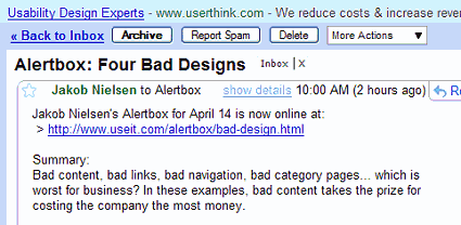
    What could be more ironic than to receive an email from Jakob Nielsen’s Alertbox on the topic of “Bad content, bad links, bad navigation, bad category pages” that links to a page that throws a 403, permission access denied page?-) Fortunately for you, I got screenshots, followed by some commentary on the article once the good folks at UseIt.com realized the error or their ways.

    First the email:

    Jakob Nilesen’s altert box email of 14-Apr-08

    Then the broken page link:

    Jakob Nilesen’s broken page link to 4 bad design

    Now onto the article …

    Yeah, I know, I’ve offered similar errors before – but then again, I’m a one man operation who posts whenever I feel I have something compelling to discuss. In this case, I think the content of Nielsen’s article “Four Bad Designs,” once liberated from the restrictions of an errant and untested .htaccess file and/or mod_apache directive provides both a compelling and worthy discussion of:

    Bad content, bad links, bad navigation, bad category pages… which is worst for business? In these examples, bad content takes the prize for costing the company the most money.

    Bad Content: Jazz at Lincoln Center

    Here, the good Dr. poses the age-old question “where’s the beef!?” And while his point is about scant detail about an upcoming performer, I could say the same applies to church websites when announcing guest speakers and/or special events.

    Links without Information Scent: New York Times

    If Jakob Nielsen were writing about church websites, he’d perhaps pose the question ‘Who’d want to click on “Next Sermon in Tithing”?

    In other words, give your links some “what’s in it for the reader” type jazz.

    Interior Splash Pages: Christopher Norman Chocolates

    This is directed at the growing number of church and/or charity web masters who think for some reason it is compelling and cool to embed huge, bandwidth consuming Flash-based slide shows for each and every category of your website.

    I think Nielsen sums up my opinion of this sin when he opines:

    Splash screens are bad enough when they sit in front of a site’s real homepage, but at least users encounter those screens only once. With a splash screen for every category, users have to click through many extra pages to see all the products.

    Amen, preach it brother!

    Metaphor Run Amok: Specialized Bicycles

    Dr. Nielsen’s point also applies to gizmos, gadgets, and special effects that continue to plague a plethora of parishioner inspired web pages.

    The Business Cost of Bad Design

    Two words: empty pews.

    Meaning, the general reaction by first time visitors to the above design issues is that they become one time, never again visitors.

    Think about that the next time someone comes to you with a a website idea that is more style than substance. Better yet, send a link to this article to your pastor and youth minister – so the next time they hit you up with a “great idea” you can remind them of that “4 bad designs” article link you sent them back on April 14, 2008.

  • Inaccessible, that’s what you are

    I find too many church and charity websites putting their best information out of reach. Hence the idea driving today’s bad church web design poster is best sung to the tune of Nat King Cole’s classic, “Unforgettable,” followed by my usual ‘snarkastic‘ enumeration of this pesky issue:

    Inaccessible, that’s what you are
    Inaccessible so near, yet so far
    Like a hy-per-link that eludes me
    How the four-o-four page so annoys me
    Never before has one suffered more

    Heal Your Church Website bad Design Poster #5: Inaccessible

    Inaccessible in many ways
    And forever more, that’s how it stays
    That’s why, ad-min, it’s incredible
    That something so intolerable
    Thinks that I am intolerable too

    <instrumental interlude>
    No never before
    has one suffered more ooh

    Pretty corny? You becha! Pretty common, absolutely. In fact, when it comes to accessibility and church websites – I think the out-of-reach bag of chips pictured in the poster photograph sum up the frustration often felt by many seekers who visit church websites, only to loose their cents and their sanity selecting options that take them nowhere.

    In other words, though most talks of web accessibility are often limited to those topics covered in Mark Pilgrim’s seminal “Dive Into Accessibility” — I would like to expand the conversation today a number of examples where I find church webmasters needlessly impairing their users in the following ways:

    • Bed and breakfast markup
    • Employing browser-specific navigation
    • Charging a fee to read sermons and/or Bible studies
    • Not thinking through the information architecture of the website
    • Displaying Flash content with no browser detection and alternative content

    Bread and BReakfast!

    ‘B and BReakfast markup’ is a handy mnemonic mechanism to memorize how not to semantically collude your online sermons and studies with misused taggery such as < b > and < br >.

    There’s enough existing (x)HTML taggery out there to make your markup match the meaning of your message. Trust me, you’ll thank me for this when you eventually publish a book and/or study guide based on your blogged sermons.

    I write about this in some detail though recent improvements in better-written blogging and CMS applications are making this less and less an issue over time.

    Browser-Specific Navigation

    Here I’m describing those instances where someone employs something like those nifty cool slide-in, drop-down, tree-expanding menus that only work on Microsoft Internet Explorer.

    Or just as evil, uses a DuHtml menu whose sub-choices require the lightening fast reflexes of an over-caffeinated super-hero to click before they disappear.

    Charging for Sermons

    I had actually received an email on the topic – but lost the link (bad dean, bad!). None-the-less, my point is, sermons, Bible studies and other such “opium content” are critical elements that those shopping for churches online use to gauge whether or not they’re going to visit a particular church on Sunday.

    More on this in my post “Is your church website little more than brochureware?

    Information Architecture

    Also known as your informational hierarchy, your navigational hierarchy, your navigation tree and/or your site map.

    This rose by whatever name needs to be well organized enough for the average Joe or Jane to figure out.

    Yes, it means putting down the mouse and thinking first then coding – but it is well worth it as categorizing information enhances church website conversion goals.

    Flashination

    About the only thing more annoying to me than the spinning .gifs of gold lamé crosses on ‘KJV only’ church websites, are Flash-based church websites – or heavy Flash use church websites – that provide no alternative content for those who have not installed the latest and greatest Flash reader plug-in; and/or just don’t view Flash due to restrictions of work, bandwidth and/or physical disability.

    I write on this over-used and/or poorly implemented media all too often here to cite a singular article … so does Vincent Flanders who defines the practice ‘flashination‘ in a slightly more adult parlance.

    Betcha can’t eat just one

    Bottom line is, having inaccessible content is about as frustrating as offering a person a single Lay’s potato chip – whereas making things easy to reach and read is like providing them a sumptuous feast of data that will keep them coming back for more.

    The choice is yours.

  • Is your church website little more than brochureware?

     Little image of little brochure with little contentThe WikiPedia defines brochureware as: “A brochureware website is a business website that has very infrequently updated content, and little of it. Often the site has been developed as a direct translation of existing printed promotional materials, hence the name.

    Note the emphasis, that’s mine.

    This is because I’ve run into more than one church website that is nothing more than a big-honking Adobe PDF file – or worse, a big-honking graphic file – that is in fact nothing more than an online version of their printed brochure.

    The same WikiPedia article asserts “Brochureware sites therefore take little advantage of the capabilities of the web that are missing in printed publication. Often the only hyperlinks on the site are in the site’s navigation menu.

    Note again the emphasis, also mine.

    This is because most who use the web are seeking – and expect – online more than what is available in a printed brochure.

    Here are a few questions you can ask yourself and/or your church webmaster to see if your site falls into the category of brochureware:

    • Is the website designed around an existing printed brochure?
    • Does the website heavily employ PDF or graphic files to represent text?
    • Is the content on your website generally dynamic or static in nature?
    • Is the church website nothing more than one-big-honking brain-dump page created out of Word?
    • Does the church website have a usable search feature?
    • Is your church website rendered with Microsoft FrontPage or Microsoft Publisher?

    If you can answer yes to ANY of these questions, then your church website may be in part or in whole brochureware.

    Here are some past examples and topics on this topic:

    I’m sure some of you can think of some other traits and/or articles related to the topic. If so, leave a comment – in love – so we can all learn from it.

  • Top 10 Church Website Design Mistakes of 2007

    It is the last day of 2007, so like every great media outlet I figured why not go through the archives and come up with a list of those topics that produced the deepest and most memorable mental scars. Below is my list of the top ten mistakes I’ve seen on church websites over the past year.

    Mistakes I would hope that as a body we would resolve to remedy, though I suspect like most new year’s resolutions are destined for abandonment by about the 14th of February.

    So with limited commercial interruption, I offer Mean Dean’s Top 10 Church Website Design Mistakes of 2007:

    1. Believing you are your user:

      Unless you’re writing a church website for a bunch of blogging pastors, frustrated graphic artists and/or “… burned out computer geeks, your user isn’t you. … This is very hard to get through somebody’s head; it’s very hard to get rid of this notion that what you like your user is going to like… Again, your user is not you.”

      For the most part, people aren’t seeking the church experience online – rather they are shopping online for a real-world church experience. Those church webmasters that fail to realize this, fail to realize the full potential of their church website.

    2. Flashination:

      Flashination is a term I give to (church) websites that seem to be overly fascinated with Macromedia/Adobe Flash. What many church web servants fail to realize is that “.. fancy media on websites typically fails user testing …” at least according to Jakob Nielsen’s recent AlertBox entitled “Low-End Media for User Empowerment.”

      Where I see Flashination most often is on banners, headers, and home pages of church websites – usually in the form of scrolling images from the Church. A visual effect that is cool precisely ONCE and from then on becomes a bandwidth consuming annoyance.

      In response, allow me to quote some sage advice from Dr. Nielsen who wrote in his 1996 ‘Original Top Ten Mistakes in Web Design:’

      Never include page elements that move incessantly. Moving images have an overpowering effect on the human peripheral vision. A web page should not emulate Times Square in New York City in its constant attack on the human senses: give your user some peace and quiet to actually read the text!

    3. Church-speak:

      Without getting into a raging debate over speaking in tongues, those in charge of getting out their church’s message need to understand that, at least in the U.S., 1 in 3 adults is unchurched. Meaning 1 in 3 adults don’t understand the church-speak that ‘bables-up‘ scribed in expensive color brochures, sermon videos and web sites.

      Fact is, the church website isn’t about offering online brochureware nor a meas to show how cool a computer geek you are. The purpose of your church web page design is to convey the Christ that is in your congregation to the World by addressing the needs of seekers and members … AND by disciplining the same with the solid food of the Gospel.

      If you do both these things then I can guarantee that you will not have to spend $5k on a Search Engine Optimization (SEO) expert, nor will you have to worry about justifying your church’s online marketing expenditures.

    4. Turning your Homepage into a Splash Page:

      What does it profit your church or charity’s website to have the most beautiful web pages ever designed if it doesn’t convince people to visit your church, engage in your ministries, or at least inquire for more information? Yet more and more often I review a graphically and technically impressive church website that is more an art project than effective ministry tool.

      In the worse cases, the home page has become such as testament to the web designers Flash and CSS skills that the home page loses its effectiveness as an introductory and central point of navigation – degrading into a sometimes technically adept and entertaining splash page.

      And if you don’t know what’s wrong with having a splash page – regardless of the webmaster’s displayed technical prowess – then we need to have a long email correspondence.

    5. Thinking you’re Spurgeon:

      There is something to be said about Shakespeare’s oft-quoted assertion from Hamlet:

      … brevity is the soul of wit …

      Or as usability expert Jakob Nielsen writes his 1997 post entitled “how people read the web:”

      People rarely read Web pages word by word; instead, they scan the page, picking out individual words and sentences. In research on how people read websites we found that 79 percent of our test users always scanned any new page they came across; only 16 percent read word-by-word.

      Or as I say in my post “George Orwell: 12 blogging tips:”

      If all else fails, just remember this tried and true adage: “You’re not Spurgeon, quit trying to write like him.”

    6. Image Bloat:

      The <img> tag in HTML should be treated with the same suspicion one glowers upon all those slickly packaged low-cal cookies we see in the diet food aisle of the grocer. Both promise to avoid a glutton’s guilt – but in both cases it smoke and mirrors, leaving you feeling bloated and sluggish.

      One of the most perpetuated sins of church web design is image bloat – most often perpetrated in the form of thinking that somehow, the height and width argument of the <img> tag somehow magically and physically shrinks an image file. It doesn’t – it only appears that way. Or in in the immortal words of usability and marketing guru, Vincent Flanders who wrote in his Father Flanders’ Sermon for Sunday, July 13, 2003:

      Just because Jesus miraculously turned water into wine doesn’t mean he can miraculously turn your 1280- x 1024-pixel image whose file size is 1.8Mb into an image whose file size is only 74Kb just because you changed the WIDTH= and HEIGHT= attributes to WIDTH=”420″ and HEIGHT=”336″.

      This mistake is so common that it’s beginning to be as annoying to me as the confessions of the students of the young men of my Jesuit high school were to Father Ambrose “For your penance say three Hail Mary’s” Forsthoefel.

      In English, just because I write: <img xsrc=”mychurch.jpg” height=”160” width=”240”> does not magically or physically make my 920k image posted straight from my brand-spankin’ new digital camera load like a 20k image. Instead it means I make a page that should load in about 8 seconds take 188 seconds!

    7. Using Religion is a ‘Chruch:’

      We all know know at least one atheist, agnostic or skeptic who boldly (and often blindly) asserts religion is a crutch. Much in part due to the overbearing legalism and spiritual abuse that goes on in a minority of cases.
      That said, I it is my prayer that the Church on the whole prove these individuals wrong, not only with Christian love and charity, but also with correctly spelled <title> and <header> tags.

      Especially those whose message is unintentionally geared at a dyslexic demographic with typos such as “baptsit chruch.”

    8. Missing the usual suspects:

      Let me translate the above point for those of you who still think a long animated Flash splash page leading to a huge image of your church’s empty parking lot is the way to go … more and more individuals shop for church homes online, the greater the risk your church runs into never seeing them visit if your church website sucks!

      Yeah, pretty brutal – but enough of the ‘meme’ that God content is important, that aesthetics aren’t important. In other words solve their problems; don’t show off your fancy-schmancy solutions. Solving their needs is as simple and common sense as making the following information easy to find, read and render in print:

      • Church denomination
      • Geographic location
      • Days and times of services and studies
      • What stuff you have for their kids
      • Example sermons that show you’re not some slathering cult
      • Smiling, inviting faces instead of stony facades
      • Email contact
      • Phone number

      Yeah, you’d think the above list is obvious … but don’t get me started.

    9. Using graphics for text:

      What does it profit a charity to have the coolest web site design of all time if it can’t be found via a simple, context-related search on Google or Yahoo?

      That’s what you bargain for when you opt to use an image file, a Java applet or Flash to render the title and slogan of your church and/or charity website.

      A situation made much worse by those who go one step further and render their menu navigation using the same bandwidth busting technologies – in the day and age of CSS.

    10. Games, Gimmicks and Gizmos:

      I don’t know about you, but to me the Cross is an ‘emblem suffering and shame,‘ which is why I find the spinning animated version of it so offensive. It not only trivializes what happened to our Lord on that painful day, but it also makes your church website look cheap.

      So do ’special effects’ such as cursor trailers, pop-up windows, scrolling marquees and Flash-intros. Yes, they may look slick the first time and all your geek buddies will think you’re cool, but such contrivances quickly become annoying hindrances to individuals who are actually in need of some compelling content.

      Don’t get me wrong – don’t be afraid to use various technologies, just make sure there is a legitimate need.

      rule of thumb #4: Just because you can, doesn’t mean you should.

      rule of thumb 4.a.: you’re not allowed to have a spinning gif of a gold lamé cross on your website unless you have the same atop the roof of your church!

    And we’re done. I’m sure some will disagree, and that’s fine – some will add to the list, and that’s fine too. Just remember if you leave a comment, leave it in love so we can all benefit and learn from it.

    Now go out there and have yourself a great 2008!

  • How categorizing information enhances church website conversion goals

    Not everyone enters your church through the front door, neither does everyone first visit your organization’s website comes via your carefully crafted home page. The question is, once these search-engine driven seekers find your site through such pages, are they encouraged and equipped to continue browsing your domain?

    Conversion Goals

    First things first, remember what the conversion goals are for your church or charity website. For those who are new here, conversion goals are actions in which we would like visitors to engage. I’ve got an entire category myself dedicated to this topic, but for those in a hurry, here are some examples of the type of desired actions I’m talking about:

    • visit a Sunday Service
    • register for a Wednesday night dinner
    • sign-up for the email newsletter
    • download and/or print a sermon
    • request a call

    Information Hierarchy

    Grouping your organizations information is one good way to offer visitors the ability to easily “drill down” into areas that interest them. While the structure of each church and/or charity’s information architecture varies, here’s a suggest list of main categories with which can be customized to suit your organization’s needs:

    • About Us – could include links to a staff page, the terms of use, how to join, and/or church history data
    • Events – abstracts into links into more detail, links to a calendar page, perhaps a place to offer RSS and ICAL linkage
    • Directions – with Google maps and other goodies, here’s a place to offer content that drives in searches by location
    • Ministries – more on this in a moment, but mostly links into individual pages describing ministries the church offers
    • Resources – a link to sermons, podcasts, useful URLs, photo galleries, steps to Peace with God

    White Space is your Friend

    The nice thing about breaking-up your site into main categories is that you can at first have a single “category” page to provide overviews that lead into sub pages of specificity as individual topics within the category become better defined online.

    Put another way, don’t use the categories to create big, huge, monoliths of information that require 15 page scrolls get to the good stuff at the bottom. Instead, as each item becomes better defined by your web team – sub pages are spawned off to contain concise individual chunks of information on specific topics. A good example of this could be your “ministries page” which at first starts out as a single definition list, then evolves into the following sub pages:

    • Children’s Ministry
    • Missions
    • Music
    • Sunday School
    • Youth

    Navigation Theme

    I’ve seen some church websites – actually I’ve seen too many – where each “category” has a different navigation theme. While this may (or may not) make sense to someone visiting through the home page, it can cause confusion with a first time visitor coming in through something like your “directions” and/or “ministries” page. Some quick ways to remedy this are:

    • pick and stick to a main navigation menu throughout every page on your website
    • provide sub navigation by broad category that enables users to “drill down” into specific topics
    • make sure page titles match main menu navigation choices
    • make sure page sub titles match sub menu navigation choices
    • don’t get cute with the menu names, church speak only creates unnecessary barriers (not to mention page maintenance issues for the developer in the future)

    Room for Growth

    As one can see, there are several advantages to building one’s site around a well-defined organization architecture. Here are a few that come to mind:

    • works well with most CMS and blogging systems
    • popular sub-categories can be easily elevated into main categories, such as sermons
    • categories can themselves become “landing pages” or portals into the website
    • information along a specific interest can be aggregated in its own RSS feed
    • individual pages/articles can be farmed out across many individuals – reducing the need for one person to maintain a large site all on their own

    Class dismissed! Now go visit my Jordanian journey post to see what I look like 100lbs lighter, atop the foothill that hold the Monastery at Petra or what I’m calling ‘Dean’s day at Al Deir.’