Tag: usability

  • 5 things we can learn from the Winston-Salem Hampton-Inn Toaster Czar

    See why the Soup Nazi is a bad model for supporting users of your church and/or charity website .This weekend, I ran into an elderly gentleman whom appointed himself the ‘Toaster Czar’ in a fashion similar to the infamous ‘Soup Nazi‘ of Jerry Seinfeld fame. I made the mistake leaving my bagel momentary unattended to go get coffee while trying to enjoy the complimentary breakfast at the Hampton Inn Winston-Salem-I-40/Hanes Mall. Here are 5 things your church and/or charity webmaster can learn from this experience:

    1. don’t assume you know your user’s context;
    2. don’t assume you know your users work-flow;
    3. don’t assume you know what’s best for your user;
    4. don’t assume your user will appreciate your intervention; and
    5. don’t assume your user is stupid.

    Note that all 5 points deal with assumptions. For example, regarding context, one might assume that the individual pictured below is waving and saying “hellooo” – or they could be waving us off saying “noo.”

    bagels enjoyed in the public setting of the Hampton Inn Hotel lobby

    Another example, regarding knowing what’s best, thinking they are stupid and/or not understanding their work-flow, the aforementioned toaster czar possibly assumed that the unattended bagel in slots 1 and 2 of a 4 slot toaster were either:

    • done;
    • done enough;
    • abandoned;
    • in his way; and/or
    • there to annoy him

    Whether or not my opinion of his motives are correct, my view is that he potentially didn’t take into consideration the following user-centric scenarios:

    • some like to eat their bagels in the context of their coffee;
    • some like to engage in a work-flow that includes getting coffee while the bagel toasts;
    • some are confused when 1 slice of the bagel remains in the toaster while the other sits on the counter, replaced by some one else’s bagel half;
    • some lose their appetite when others not involved in food services touching their food; and
    • some don’t like being treated as if they are the problem when in fact all they wanted to do was toast their bagel and eat breakfast in relative peace.

    In the same way, you as church webmasters should consider that your users:

    • may like to consume your church website content in some other context other than initially planned – for example, aggregators and/or mobile phones come to mind;
    • may like to consume your charity website in an order other (work-flow) than initially imagined and/or programmed – for example, site navigation through search engines comes to mind;
    • may need more information when things operate outside of normal expectations – for example, more informative 404 errors for pages not found come to mind;
    • Click here to see a video about Nick Burns, a hilariously popular character of former SNL funnyman Jimmy Fallon.may get turned-off if they find content they contributed modified without annotation – for example, modifying a user’s comment on a church blog or bbs without noting it was edited by a moderator or admin will drive users away permanently;
    • may not want nor like the Jimmy Fallon/Nick Burns ‘Your Company’s Computer Guy‘ approach to web site support (let alone a communal toaster).

    Bottom line, don’t be a toaster czar.

    Treat users as you would guests in your house, not as idiot low-life’s whom annoy by making you wait an extra minute or two simply because they happened to get to the proverbial toaster 30 seconds before you did.

    In other words, you are not your users – so don’t assume you completely understand their interface to your system without collecting realistic and specific usage metrics and spending some time setting next to them while they demonstrate how they navigate your site the way they do, and why.

    What about you? Got a similar story or useful use case/test scenario to share? Leave comment in love!

    In the meantime I leave you with this aggregation from the above caricatures : “moooove … no soup for you!… was that so hard? … come back, 1 year … you’re Welcome

  • Is Church marketing dead? Nope, just stuck on stupid!

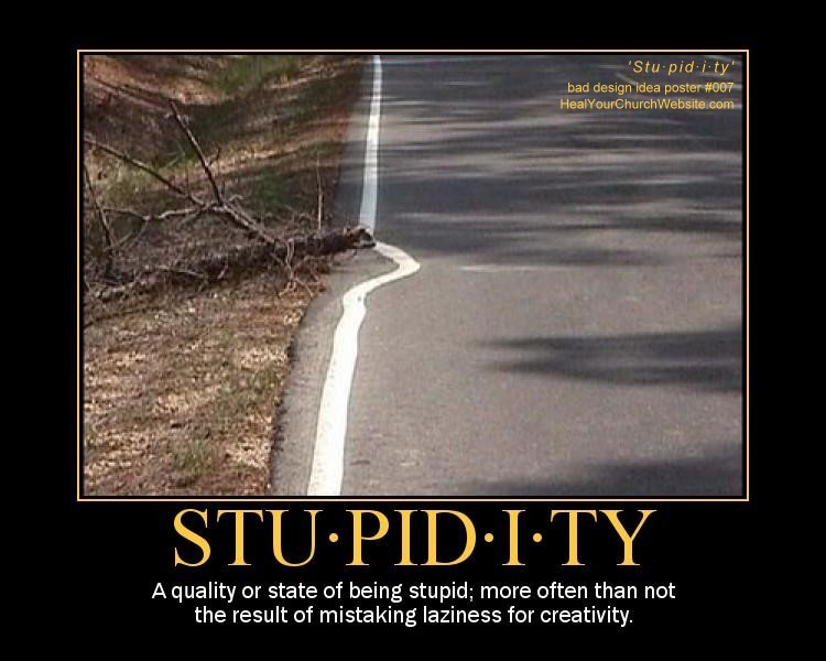
    Bad church web design poster 007 - Stu·pid·i·tyThere’s no getting around it, despite the efforts of many to teach, rebuke, correct & train in righteous web design, there still exists a great cloud of witlessness when it comes to the Church’s presence online. A fact painfully corroborated by the persistent body of ‘kitsch‘ out there that distracts, annoys and otherwise drives-away people seeking and/or serving the Lord.

    WHOOOOSH – flame on!

    I should know, as I’ve been engaged in mental combat with these forces of evil web design idioms since the turn of the new Millennium, first in collaborating with Vincent Flanders on his second book, an act which lead to the eventually May 2002 establishment of Heal Your Church Website.

    But enough of my credentials, lest I start this post start sounding like a Pauline epistle, though I should probably mention that I do the software as a service thing for a living … but that’s plenty about me, as others equally qualified have since dashed headlong into the breach.

    This would include Cory Miller and James Dalman at Church Communications Pro (CCP), the latter of whom begged the all important question: “Is Church marketing dead?” Specifically, pondering aloud:

    There is something going on but I quite can’t put my finger on it. It’s a gut feeling that’s right more often than not. I think the church landscape is drastically changing and that church as we know it now is going to evolve (no, I am not supporting Darwin) into something much different. It’s just a hypothesis or idea I’m working on, whatever that’s worth.

    To which my response is: “James, let me save you a few steps. Church marketing isn’t dead, it’s just stuck on stupid!

    If that weren’t the case, why would sites and services such as CCP, Church Marketing Sucks, For God’s Sake Shut Up, and a handful of others continue to, and with apologies to Vincent Flanders, offer weekly lessons in good church marketing by looking at examples of bad church marketing?

    I mean, how many examples of church websites adorned with the cliché gold lamé animated gif of a spinning cross that screams “everything I know about website design I learned from Strong Bad!“ do we need to ‘Fisk‘ to make our point?

    Or on a more serious note, how many of us seen all to many unique local churches dive through the porpoise-driven hoops of Warren-ology just to become different like everyone else?

    And that’s really my point, it’s not that church marketing is dead, it is that we’re stuck on driving down the wide and easy path to church marketing, rather than seek out a difficult path that includes:

    • Studying Scripture to see where marketing and evangelism intersect;
    • Teaching lay staff and church on what real marketing is and how it works;
    • Understanding that the Church didn’t start in 2000, but rather 2000 years ago;
    • Putting aside the need to agree 100% with everyone 100% of the time;
    • Initiating marketing teams as opposed the message controlled at a single point;
    • Daring to be different without amputating one’s self from the Body.

    Look, we have centuries of beautiful sacred songs, art and literature as the result of the artistry that was once the Church’s … why can’t we have the same for church marketing in the 21st century?”

    Or put another way, Franky Schaeffer was right when he asserted that Christians are no longer influencing society through various forms of media, but are instead influenced BY it. A neat trick when you think Francis Shaeffer’s son warned us about this as far back as 1981!

    WHOOOOSH – flame off!

    Oh, and before I forget, to my Eastern Orthodox friends … a belated Χριστός Ανέστη!

  • 10 Principles Of Good Church Website Design

    Want to make sure your church website follows the principles of good church website design? Then stop coding that rotating Flash banner you think is cook and start learning how user-centric design has become a standard approach for successful websites with high conversion rates.

    The article includes eye scan reports/models to check for page hot spotsAnd in order to use the user-centric designs that make for a good church website experience, we first need to understand how users interact with web-sites, how they think and what are the basic patterns of users’ behavior. A good place to learn how this is via a recent Smashing Magazine article entitled “10 Principles Of Effective Web Design.”

    In this article, the author asks and answers the question “How do users think?” by correctly asserting:

    Basically, users’ habits on the Web aren’t that different from customers’ habits in a [bricks-and-mortar] store …

    … Most users search for something interesting (or useful) and clickable; as soon as some promising candidates are found, users click. If the new page doesn’t meet users’ expectations, the Back button is clicked and the search process is continued.

    The reasonings for this point are simple issues of common sense:

    • Users appreciate quality and credibility;
    • Users don’t read, they scan;
    • Web users are impatient and insist on instant gratification;
    • Users don’t make optimal choices;
    • Users follow their intuition; and
    • Users want to have control

    eye scanning - movement tracing results from the articleThe article expounds on each of the above points not only in word but in the deed of citing eye tracking scan paths of sample pages. The article doesn’t stop there, enumerating in detail 10 principles of good web design that we all can apply to our church and/or charity websites. The principles being:

    1. Don’t make users think
    2. Don’t squander users’ patience
    3. Manage to focus users’ attention
    4. Strive for feature exposure
    5. Make use of effective writing
    6. Strive for simplicity
    7. Don’t be afraid of the white space
    8. Communicate effectively with a “visible language”
    9. Conventions are our friends
    10. Test early, test often

    I’ve made similar points, only not as concise and well outline as the aforementioned article.

    So why not read it, then come back here for some discussion and comments on how the above points apply to your particular circumstance.

  • How to avoid high maintenance church website design

    High Maintenance: Lamborghini v. Mommy VanFor what will it profit a man if his church website is the slickest in the Internet if he has to forfeit a month’s collections just to change the welcome message?

    If you haven’t guessed by the play on Matthew 16:26 (&/or Mark 8:36, &/or Luke 9:25), or the somewhat wordy “bad church web design poster #006,” the topic of today’s “sermonette” is website maintenance.

    You see, there’s a dirty little secret that professional web developers such as Tim Bednar, Mike Boyink, and myself have known for years:

    Creating and designing websites is alluring and hi-profile work – whereas maintaining code and a consistent stream of compelling content is difficult and is about as glamorous as the janitor who keeps the church toilets clean.

    A point made all the more sharper, like a pointy stick in the eye sharper, when you fall into the trap of having that college kid studying home on spring break create for a really super-click Flash-based church website that everyone – and only – those in his age group and demographic can ‘really appreciate.’

    Then the train wreck occurs sometime in early October when said student is back at art school and your poor church Secretary has to post updates from those in the field on summer mission programs.

    Sound Familiar?

    If not, just give it time. Since 2002 when I started out on my crusade to teach, rebuke correct & train others in righteous web design I’ve seen literally hundreds – perhaps thousands – of church websites that went down this path to obscurity and frustration.

    And this is why we find churches equipped with data-driven content management systems, or at least driven-by a reasonable blogging system, providing pages with excellent search engine rankings and the visitors and conversion rates to show for it.

    Sound Good?

    Okay, so if I’ve sold you on the concept that maintenance is the key to a successful online ministry, then perhaps then I can also convince you and/or your church to engage in the following processes to keep it going for years and years even though your resources are tight and your time tighter:

    • Establish a web ministry team comprised of the following mix of talents:
      • a member of the church staff
      • a software developer type
      • a hardware geek
      • a graphic artist type
      • a word-smith
      • a marketeer
    • Consider employing a content management &/or a logging service to render your church website such as:
    • Engage in a formalized design process before writing a single line of HTML/code that includes:
      • reviewing what’s out there
      • understanding your neighborhood
      • setting attainable goals and objectives
      • establishing minimum requirements
      • defining an informational architecture
      • creating a project plan
    • Execute a development plan that includes the following steps:
      • designing a prototype
      • soliciting user feedback
      • building the system
      • testing functionality
      • testing use cases
      • testing loads and bandwidth
    • Follow-up with a maintenance plan that includes:
      • user education
      • staff training
      • analysis of web analytics
      • data & system backups
      • disaster recovery drills
      • security audits
      • error-log reviews
      • checks of search engine ranking
      • software upgrades
    • Security ongoing success with:
      • rotating in/out new members to your committee;
      • occasionally testing new applications and technologies;
      • periodically soliciting feedback from seekers and church members;
      • make sure there’s a line item in the church budget for the website.

    Sound Too Hard?

    Now if you’re panicking a bit over some of the items above – don’t sweat it. If you’ve took my advice to create a team that includes both a hardware and software geek, you’re good to go on those issues like “use-case testing” or “disaster recovery drills.

    And if you’re too small to do the above – again, don’t sweat it – simply figure out what you can do from the above list with what you’ve got, never forgetting that putting up a website is easy – it’s the maintenance that’s a killer.

    For which of you, desiring to build a tower, does not first sit down and count the cost, whether he has enough to complete it? Otherwise, when he has laid a foundation and is not able to finish, all who see it begin to mock him, saying, ‘This man began to build and was not able to finish.’ Or what king, going out to encounter another king in war, will not sit down first and deliberate whether he is able with ten thousand to meet him who comes against him with twenty thousand? And if not, while the other is yet a great way off, he sends a delegation and asks for terms of peace. So therefore, any one of you who does not renounce all that he has cannot be my disciple. – Luke 14:28-33

    (psst: oh yeah, in case you didn’t figure it out, you click on the small image of the poster above to get to the really-big version you can print out and nail to the door of your church)

  • Is your church website little more than brochureware?

     Little image of little brochure with little contentThe WikiPedia defines brochureware as: “A brochureware website is a business website that has very infrequently updated content, and little of it. Often the site has been developed as a direct translation of existing printed promotional materials, hence the name.

    Note the emphasis, that’s mine.

    This is because I’ve run into more than one church website that is nothing more than a big-honking Adobe PDF file – or worse, a big-honking graphic file – that is in fact nothing more than an online version of their printed brochure.

    The same WikiPedia article asserts “Brochureware sites therefore take little advantage of the capabilities of the web that are missing in printed publication. Often the only hyperlinks on the site are in the site’s navigation menu.

    Note again the emphasis, also mine.

    This is because most who use the web are seeking – and expect – online more than what is available in a printed brochure.

    Here are a few questions you can ask yourself and/or your church webmaster to see if your site falls into the category of brochureware:

    • Is the website designed around an existing printed brochure?
    • Does the website heavily employ PDF or graphic files to represent text?
    • Is the content on your website generally dynamic or static in nature?
    • Is the church website nothing more than one-big-honking brain-dump page created out of Word?
    • Does the church website have a usable search feature?
    • Is your church website rendered with Microsoft FrontPage or Microsoft Publisher?

    If you can answer yes to ANY of these questions, then your church website may be in part or in whole brochureware.

    Here are some past examples and topics on this topic:

    I’m sure some of you can think of some other traits and/or articles related to the topic. If so, leave a comment – in love – so we can all learn from it.

  • When web page creation tools and novice church website design collide

    One of the good things about the Web in 2008 is the number of free and easy web page creation tools to aid those novices involved in church website design. One of the bad things about the Web in 2008 is the number of free and easy web page creation tools novices employ to generate unusually unusable church websites.

    Case in point, Sabbath Day Church of God Hot Springs Arkansas, brought to you by Web Page Maker V2; a web page generation tool described on its own website as:

    … an easy-to-use web page editor that allows you to create and upload web pages in minutes without knowing HTML. Simply drag and drop objects onto the page and position them freely in the layout.

    It also appears that it is an easy-to-use web page editor that allows you to create web pages in minutes without knowing usable interface design, conversion goals, semantic HTML, and other important details. Basically, all the bad things one gets with FrontPage at only a 1/3rd the expense of FrontPage.

    That said, here are 5 things I would do to improve the web presence for the Sabbath Day Church of God:

    1. Since there is information provided on a weekly basis, consider using a blog as a content management tool. It’ll help both better organize and present otherwise compelling content.
    2. Move the prayer list page behind a password protected area – as the current format may expose the church to some unwanted privacy concerns.
    3. Lose the Java Applets – such counters are not needed in a day and age of far better usage measurement tools as Google Analytics. Such counters also slows down the page load ALOT.
    4. Optimize those bloated images.
    5. Lose the grainy-green background image – it makes the black text entirely unreadable.

    There are other things I might do as well, perhaps leverage Google Calendars and Google Maps instead of the current calendar and map solutions.

    I most definately would put the phone number, location, along with the dates and times of the services in a far more conspicuous place then hiding said lamp under a bowl as is currently the case.

    Other observations? You know the drill, leave a comment – in love – so we can all learn from it.

  • Bad church web design poster 0004 – Mission Statements (suck)

    Programmer guru Joel Spolsky reminds us that usability tests often demonstrate that very few users read the words you put on screen. Couple this the fact that 1-in-3 users are un-churched, and I’d venture to say that Nielsen is right – just about nobody reads nuthin’. Instead like wild animals, they just hunt it, scan it, and categorize it in their pretty little pumpkin heads and move on.

    Or as the good Dr. writes in his latest alert box entitled “Blah-Blah Text: Keep, Cut, or Kill?“:

    Introductory text on Web pages is usually too long, so users skip it. But short intros can increase usability by explaining the remaining content’s purpose.

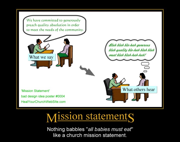
    Which all leads me to yet another addition to our growing gallery of bad church website design posters, this one entitled “Mission Statements:”

    For those of you who didn’t figure out that clicking on the thumbnail above gets you to ‘the big picture,’ – this poster basically preaches a lesson shouted from the mountain tops by Father Flanders that asserts:

    “[Mission statements] should be abolished because every Mission Statement ever written can be summarized in four words — ‘All babies must eat.’”— Vincent Flanders, author of Son of Web Pages that Suck

    Or to paraphrase Coding Horrors’ Jeff Atwood – replacing the term user and software to our advantage:

    My intent is not to make fun of [church goers and/or seekers], but to illustrate that there are far more effective ways to communicate with your dog. Essentially, any time you’re asking [a visitor of your church website] to make a choice they don’t care about, you have failed the [visitor]. Well designed [church websites] takes care of “[Christianese or church-speak ]” all by itself, and leaves the [seeker] free to worry about things relevant to the [information they seek].

    And for you fans of Gary Larson’s Far Side who recognize the inspiration for my poster, Mr. Atwood also has in the same article I just mis-quoted, an example of “what we say to dogs … vs … what they hear.

    Once again, as a living reminder of not-so-intuitive design, you click on the small poster to see the full-sized version, but please, no hot-linking without providing a link back here to the article – not just the pix.