Category: How-To

  • Top 10 Church Website Design Mistakes of 2007

    It is the last day of 2007, so like every great media outlet I figured why not go through the archives and come up with a list of those topics that produced the deepest and most memorable mental scars. Below is my list of the top ten mistakes I’ve seen on church websites over the past year.

    Mistakes I would hope that as a body we would resolve to remedy, though I suspect like most new year’s resolutions are destined for abandonment by about the 14th of February.

    So with limited commercial interruption, I offer Mean Dean’s Top 10 Church Website Design Mistakes of 2007:

    1. Believing you are your user:

      Unless you’re writing a church website for a bunch of blogging pastors, frustrated graphic artists and/or “… burned out computer geeks, your user isn’t you. … This is very hard to get through somebody’s head; it’s very hard to get rid of this notion that what you like your user is going to like… Again, your user is not you.”

      For the most part, people aren’t seeking the church experience online – rather they are shopping online for a real-world church experience. Those church webmasters that fail to realize this, fail to realize the full potential of their church website.

    2. Flashination:

      Flashination is a term I give to (church) websites that seem to be overly fascinated with Macromedia/Adobe Flash. What many church web servants fail to realize is that “.. fancy media on websites typically fails user testing …” at least according to Jakob Nielsen’s recent AlertBox entitled “Low-End Media for User Empowerment.”

      Where I see Flashination most often is on banners, headers, and home pages of church websites – usually in the form of scrolling images from the Church. A visual effect that is cool precisely ONCE and from then on becomes a bandwidth consuming annoyance.

      In response, allow me to quote some sage advice from Dr. Nielsen who wrote in his 1996 ‘Original Top Ten Mistakes in Web Design:’

      Never include page elements that move incessantly. Moving images have an overpowering effect on the human peripheral vision. A web page should not emulate Times Square in New York City in its constant attack on the human senses: give your user some peace and quiet to actually read the text!

    3. Church-speak:

      Without getting into a raging debate over speaking in tongues, those in charge of getting out their church’s message need to understand that, at least in the U.S., 1 in 3 adults is unchurched. Meaning 1 in 3 adults don’t understand the church-speak that ‘bables-up‘ scribed in expensive color brochures, sermon videos and web sites.

      Fact is, the church website isn’t about offering online brochureware nor a meas to show how cool a computer geek you are. The purpose of your church web page design is to convey the Christ that is in your congregation to the World by addressing the needs of seekers and members … AND by disciplining the same with the solid food of the Gospel.

      If you do both these things then I can guarantee that you will not have to spend $5k on a Search Engine Optimization (SEO) expert, nor will you have to worry about justifying your church’s online marketing expenditures.

    4. Turning your Homepage into a Splash Page:

      What does it profit your church or charity’s website to have the most beautiful web pages ever designed if it doesn’t convince people to visit your church, engage in your ministries, or at least inquire for more information? Yet more and more often I review a graphically and technically impressive church website that is more an art project than effective ministry tool.

      In the worse cases, the home page has become such as testament to the web designers Flash and CSS skills that the home page loses its effectiveness as an introductory and central point of navigation – degrading into a sometimes technically adept and entertaining splash page.

      And if you don’t know what’s wrong with having a splash page – regardless of the webmaster’s displayed technical prowess – then we need to have a long email correspondence.

    5. Thinking you’re Spurgeon:

      There is something to be said about Shakespeare’s oft-quoted assertion from Hamlet:

      … brevity is the soul of wit …

      Or as usability expert Jakob Nielsen writes his 1997 post entitled “how people read the web:”

      People rarely read Web pages word by word; instead, they scan the page, picking out individual words and sentences. In research on how people read websites we found that 79 percent of our test users always scanned any new page they came across; only 16 percent read word-by-word.

      Or as I say in my post “George Orwell: 12 blogging tips:”

      If all else fails, just remember this tried and true adage: “You’re not Spurgeon, quit trying to write like him.”

    6. Image Bloat:

      The <img> tag in HTML should be treated with the same suspicion one glowers upon all those slickly packaged low-cal cookies we see in the diet food aisle of the grocer. Both promise to avoid a glutton’s guilt – but in both cases it smoke and mirrors, leaving you feeling bloated and sluggish.

      One of the most perpetuated sins of church web design is image bloat – most often perpetrated in the form of thinking that somehow, the height and width argument of the <img> tag somehow magically and physically shrinks an image file. It doesn’t – it only appears that way. Or in in the immortal words of usability and marketing guru, Vincent Flanders who wrote in his Father Flanders’ Sermon for Sunday, July 13, 2003:

      Just because Jesus miraculously turned water into wine doesn’t mean he can miraculously turn your 1280- x 1024-pixel image whose file size is 1.8Mb into an image whose file size is only 74Kb just because you changed the WIDTH= and HEIGHT= attributes to WIDTH=”420″ and HEIGHT=”336″.

      This mistake is so common that it’s beginning to be as annoying to me as the confessions of the students of the young men of my Jesuit high school were to Father Ambrose “For your penance say three Hail Mary’s” Forsthoefel.

      In English, just because I write: <img xsrc=”mychurch.jpg” height=”160” width=”240”> does not magically or physically make my 920k image posted straight from my brand-spankin’ new digital camera load like a 20k image. Instead it means I make a page that should load in about 8 seconds take 188 seconds!

    7. Using Religion is a ‘Chruch:’

      We all know know at least one atheist, agnostic or skeptic who boldly (and often blindly) asserts religion is a crutch. Much in part due to the overbearing legalism and spiritual abuse that goes on in a minority of cases.
      That said, I it is my prayer that the Church on the whole prove these individuals wrong, not only with Christian love and charity, but also with correctly spelled <title> and <header> tags.

      Especially those whose message is unintentionally geared at a dyslexic demographic with typos such as “baptsit chruch.”

    8. Missing the usual suspects:

      Let me translate the above point for those of you who still think a long animated Flash splash page leading to a huge image of your church’s empty parking lot is the way to go … more and more individuals shop for church homes online, the greater the risk your church runs into never seeing them visit if your church website sucks!

      Yeah, pretty brutal – but enough of the ‘meme’ that God content is important, that aesthetics aren’t important. In other words solve their problems; don’t show off your fancy-schmancy solutions. Solving their needs is as simple and common sense as making the following information easy to find, read and render in print:

      • Church denomination
      • Geographic location
      • Days and times of services and studies
      • What stuff you have for their kids
      • Example sermons that show you’re not some slathering cult
      • Smiling, inviting faces instead of stony facades
      • Email contact
      • Phone number

      Yeah, you’d think the above list is obvious … but don’t get me started.

    9. Using graphics for text:

      What does it profit a charity to have the coolest web site design of all time if it can’t be found via a simple, context-related search on Google or Yahoo?

      That’s what you bargain for when you opt to use an image file, a Java applet or Flash to render the title and slogan of your church and/or charity website.

      A situation made much worse by those who go one step further and render their menu navigation using the same bandwidth busting technologies – in the day and age of CSS.

    10. Games, Gimmicks and Gizmos:

      I don’t know about you, but to me the Cross is an ‘emblem suffering and shame,‘ which is why I find the spinning animated version of it so offensive. It not only trivializes what happened to our Lord on that painful day, but it also makes your church website look cheap.

      So do ’special effects’ such as cursor trailers, pop-up windows, scrolling marquees and Flash-intros. Yes, they may look slick the first time and all your geek buddies will think you’re cool, but such contrivances quickly become annoying hindrances to individuals who are actually in need of some compelling content.

      Don’t get me wrong – don’t be afraid to use various technologies, just make sure there is a legitimate need.

      rule of thumb #4: Just because you can, doesn’t mean you should.

      rule of thumb 4.a.: you’re not allowed to have a spinning gif of a gold lamé cross on your website unless you have the same atop the roof of your church!

    And we’re done. I’m sure some will disagree, and that’s fine – some will add to the list, and that’s fine too. Just remember if you leave a comment, leave it in love so we can all benefit and learn from it.

    Now go out there and have yourself a great 2008!

  • How categorizing information enhances church website conversion goals

    Not everyone enters your church through the front door, neither does everyone first visit your organization’s website comes via your carefully crafted home page. The question is, once these search-engine driven seekers find your site through such pages, are they encouraged and equipped to continue browsing your domain?

    Conversion Goals

    First things first, remember what the conversion goals are for your church or charity website. For those who are new here, conversion goals are actions in which we would like visitors to engage. I’ve got an entire category myself dedicated to this topic, but for those in a hurry, here are some examples of the type of desired actions I’m talking about:

    • visit a Sunday Service
    • register for a Wednesday night dinner
    • sign-up for the email newsletter
    • download and/or print a sermon
    • request a call

    Information Hierarchy

    Grouping your organizations information is one good way to offer visitors the ability to easily “drill down” into areas that interest them. While the structure of each church and/or charity’s information architecture varies, here’s a suggest list of main categories with which can be customized to suit your organization’s needs:

    • About Us – could include links to a staff page, the terms of use, how to join, and/or church history data
    • Events – abstracts into links into more detail, links to a calendar page, perhaps a place to offer RSS and ICAL linkage
    • Directions – with Google maps and other goodies, here’s a place to offer content that drives in searches by location
    • Ministries – more on this in a moment, but mostly links into individual pages describing ministries the church offers
    • Resources – a link to sermons, podcasts, useful URLs, photo galleries, steps to Peace with God

    White Space is your Friend

    The nice thing about breaking-up your site into main categories is that you can at first have a single “category” page to provide overviews that lead into sub pages of specificity as individual topics within the category become better defined online.

    Put another way, don’t use the categories to create big, huge, monoliths of information that require 15 page scrolls get to the good stuff at the bottom. Instead, as each item becomes better defined by your web team – sub pages are spawned off to contain concise individual chunks of information on specific topics. A good example of this could be your “ministries page” which at first starts out as a single definition list, then evolves into the following sub pages:

    • Children’s Ministry
    • Missions
    • Music
    • Sunday School
    • Youth

    Navigation Theme

    I’ve seen some church websites – actually I’ve seen too many – where each “category” has a different navigation theme. While this may (or may not) make sense to someone visiting through the home page, it can cause confusion with a first time visitor coming in through something like your “directions” and/or “ministries” page. Some quick ways to remedy this are:

    • pick and stick to a main navigation menu throughout every page on your website
    • provide sub navigation by broad category that enables users to “drill down” into specific topics
    • make sure page titles match main menu navigation choices
    • make sure page sub titles match sub menu navigation choices
    • don’t get cute with the menu names, church speak only creates unnecessary barriers (not to mention page maintenance issues for the developer in the future)

    Room for Growth

    As one can see, there are several advantages to building one’s site around a well-defined organization architecture. Here are a few that come to mind:

    • works well with most CMS and blogging systems
    • popular sub-categories can be easily elevated into main categories, such as sermons
    • categories can themselves become “landing pages” or portals into the website
    • information along a specific interest can be aggregated in its own RSS feed
    • individual pages/articles can be farmed out across many individuals – reducing the need for one person to maintain a large site all on their own

    Class dismissed! Now go visit my Jordanian journey post to see what I look like 100lbs lighter, atop the foothill that hold the Monastery at Petra or what I’m calling ‘Dean’s day at Al Deir.’

  • 5 Simple Security Tips for the WiFi-ing Road Warrior

    As I travel to the Hashemite Kingdom next week, there are at least 5 simple things I can do to make my WiFi experiences a bit more secure. So can you, here’s how:

    During my upcoming journey to Jordan, I’ll have ample opportunities to consume the culture on a variety of levels – including the ever growing WIFI connections that now abound in the Hashemite Kingdom. This in turn will give any nere-do-wells an opportunity to consume my personal and private information; if not zombie-fry my laptop altogether. And while I believe there is no such thing as total mobile security – there are ast least 5 simple things I can do to inconvenience the lesser-determined bad-guys to the point they move onto the guy computing next to me waiting for the airplane to board.

    1. Connect Securely

    How do you know you’re securely connected to the wireless router at your favorite coffee shop? Simple, you have inconvenience the barista or the hotel staff for a WEP, or even more secure, WPA key to access the Internet.

    Yes, yes, yes, I know, WEP stinks in comparison to WPA, none-the-less, better a little hassle than to sign away one’s identity and security by confirming to use a ‘wide-open’ network.

    2. Tunnel Safely

    The problem with seeking out a WPA-PSK encryption is that many times, it just isn’t available. Merchants provide WiFi hot-spots as a competitive draw. It loses its return on investment if they find themselves busier teaching wireless laptop connectivity than selling biscotti.

    For those who don’t mind taking security matters into their own hands – or at least putting them into the hands of 3rd parties who provide VPN services; some for free. Here is a short list in alphabetical order:

    And for those on the road a lot, you might want to check to see if your hot-spot access service such as Boingo, iPass or TMobile/HS provides secure software.

    3. Surf Encrypted

    Many of us who buy stuff online already know to look for that little encryption lock in the status bar of our browser. However, have you considered looking for it when you login to an online email service?

    How about when you use the same password you use for everything when you login to a blogging service or bulletin board?

    Again, in cases where you are at the mercy of a service provider not offering secure logins and transactions, there are some not-so-stupid browser tricks you can employ – provided you have the right browser.

    For example, while gMail does provide a secure login, it does not provide encryption when I’m emailing you about my upcoming trip to Jordan. Same too when I blog this post using Google Docs.

    Fortunately, I use FireFox, which in turn allows me to plug-in the Customize Google extension, which in turn allows me to check an option to “Secure (switch to https).” Voila!

    Similarly, I Pidgin-Encrypt my instant messaging (not to be confused with the actual IM Pidgin Client, though the two are related).

    If I must to FTP, then I use SSH File Transfer Protocol (SFTP) – and when possible – using an encrypted zip file. Yes, I’m aware the PKZip password protection is inherently weak, but it’s stronger than nothing.

    4. Password Strongly

    All the security in the world won’t help me if I use the same password for everything, and that password is something relatively easy to guess or crack. For example … a login of ‘dean’ and password of ‘peters’ I would think would take even the lames of script kiddie all of 5 seconds to figure out.

    If you can’t figure out how to create a memorable but strong password, fear not. There are plenty of online services. Here are 3 that didn’t ask me who I was before generating some solutions:

    5. Speak Nothing

    Having spent some time with a top-secret security clearance, I know what the phrase “need to know” means:

    • the best way to keep a secret is not to tell anyone;
    • failing that, only tell the secret to those who must know;
    • never write anything down;
    • shred everything; and
    • trust no one.

    So asides from keeping our ‘yaps shut’ – this also means

    • turning off any file, printer and/or other fun network sharing;
    • turning on any firewall, spyware and anti-virus detection; and
    • depending on your operating system and configuration, shutting down open ports.

    Yeah, that last one is not too easy, but I figure if you’re savvy enough to run a server, you’re savvy enough to know you’ve got some entry ways your firewall may not catch (for the rest of you, just make sure your firewall application is running).

    Conclusion

    I know this last bit sounds a bit blunt – especially for those of you working with churches, charities and missions – especially that last point.

    But the last thing we need is to have our personal lives, our ministries and/or our livelihoods imperiled by an ever constant swarm of sinners who would think nothing of emptying out your bank account, ruining your retirement fun, and tapping out your travel funds to fun places like Jordan.

    Better to remain a little bit paranoid about private information so you can keep you mind on publicly pronouncing the good news that is Christ crucified and Christ resurrected.

  • How to use gmail aliases to send yourself text notifications

    Sending custom SMS text notifications to your cell phone has never been easier – thanks to 2 nifty gmail features. By combining filtering with gmail’s ability to add aliases to your existing gmail account, you can now have notifications of events, reservations, auctions, school closings and anything other text message you can send to your cell phone via email. It’s simple, here’s how:

    1. login to your gmail account (like say, gmailaccountname)
    2. click on the ‘settings’ menu on the upper right hand corner of your browser’s screen.
    3. click on the filters tab
      image identifying screen elements mentioned in steps 2 through 4
    4. click on the hyperlink that reads “create new filter”
    5. in the text box labeled “TO ” enter your gmail address + an alias, like so:
      gmailaccountname+alias@gmail.com
      image identifying screen elements mentioned in steps 5 through 6
    6. click on the “next step” hyperlink
    7. click on the check box labeled “Forward it to”
    8. enter your SMS phone number in the text box labeled “Forward it to” for example:
      9195551212@messaging.sprintpcs.com
      image identifying screen elements mentioned in steps 7 through 9
    9. click on the button entitled “create filter”
    10. use your newly created gmailaccountname + alias address as needed (e.g. gmailaccountname+ebay@gmail.com).

    Example

    This coming November I’ll be on a Biblical press tour of Jordan (see blogJordan.com for more details). I won’t have a phone, but I will have a wireless air card courtesy of the good folks at Ziad (formerly Fastlink). And since my schedule is not my own, I will be using email to send my wife a text message to let her know both of my whereabouts; and when to let my daughter know when to get to mommy’s PC for some kissy-huggy Skype sessions. Imagine doing the same on while you’re on a 2 week mission trip to Indonesia or Mexico (only contacting your wife, not mine).

    It’s simple, let’s say my daughter’s email address is PrincessPepperDoodle@gmail.com. Using the steps above, I establish a filter that forwards any email addressed to PrincessPepperDoodle+BlossomVonYumYum@gmail.com to mom’s Verizon-served cell phone at 9195551212@vtext.com

    Now some of you are saying “hey, but can’t you do the same thing filtering on the subject line?” Yes you’re right, but what about notifications from services that send you email whose subject lines you can’t control – or from friends who can’t remember to type in the super-special subject line you seek as easily as they can add your aliased email to their address book? Here’s are three examples that speaks for themselves:

    • PrincessPepperDoodle+ebay@gmail.com
    • PrincessPepperDoodle+calendar@gmail.com
    • PrincessPepperDoodle+basecamp@gmail.com

    Caveats

    As with any such solution, there’s always the downside. No exception here as I see four:

    1. Message Size – Most mobile services have significant limitations on the size of the message sent. What I’ve discovered that, at least for my carrier, that’s okay as the merely truncate the message down to the first 128 characters. I can live with that. Your mileage may vary.
    2. Cost of promiscuous text – Please, please, please don’t run off trying this solution until you’ve first checked the cost of text messaging for your mobile phone service. If you’re looking at $0.20 a message, then you may want to either pass on this solution, or reserve it for only the most dire of occasions.
    3. Lack of Throttling – This is somewhat based on my concerns over cost – what happens if either a vendor or an auction goes crazy? What mechanisms do I have to put limits on inbound messages from a sender gone wild?
    4. Overzealous spam filtering – Some subject lines and or domains may cause an important message to get caught in gmails awesome spam filter.

    All of these concerns aside, I still use the ‘wifey+daughter daddy is out of the country communications solution‘ described above.

    Conclusion

    The point is, by combining gmail filtering with + aliasing with your mobile carrier’s SMS services email address, you can begin to receive text message notifications of the emails important to you. I’ve provided an abbreviated list of some of the more popular SMS email address of your carriers below:

    AT&T
    phonenumber@txt.att.net
    Alltel
    phonenumber@message.alltel.com
    Nextel
    phonenumber@messaging.nextel.com
    QWest
    phonenumber@qwestmp.com
    Sprint
    phonenumber@messaging.sprintpcs.com
    T-Mobile
    phonenumber@tmomail.net
    Verizon
    phonenumber@vtext.com
    Virgin Mobile UK
    phonenumber@vxtras.com
    Virgin Mobile USA
    phonenumber@vmobl.com

    If your carrier wasn’t listed above – or even if it was – please, again, I implore you to FIRST CHECK with your mobile service as to the cost of receiving SMS messages. It could be that a run-away e-bay bid could cost you more in text messaging than you save on the auction.

    Then again, it could all be worth it when it comes to keeping one’s family and/or congregation aware of what you’re up to while feeding the hungry, healing the sick and tending to the in needy in far away places – like Jordan.

  • How to (really) embed Google Maps on your church website

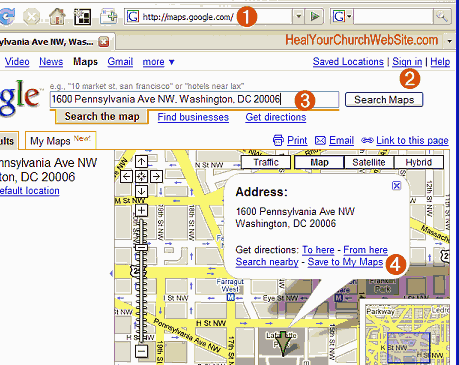
    I think it is safe to assume that getting people into the pews is a conversion goal most, if not all church websites share. But how are guests going to eat all the donuts and sleep through the sermons if they can’t figure out how to get there? One sure way to kill off the ‘it was hard to find’ excuse is embedding Google Maps on the directions page of your church website. Especially now as Google claims to have made embedding as easy a 1-2-3; though I personally think it takes about 10 real-world steps.

    Steps 1-4 of how to embed a google map

    Step 1:
    Goto maps.google.com (phew, that was easy!-).
    Step 2:
    Login to a gmail account. Yeah, note that even though you’ve added Google aps to your church’s domain, you’ll still need a gmail account. Hopefully one that reflects the name of your church will get it done. Note to Google, how about adding maps to the aps? Please?
    Step 3:
    Now, enter in the address of your church and charity. An alternative is to enter the latitude and/or longitude (uber-geeks please take notem, that would be ‘38°53′55.55″N 77° 2′11.96″W’ in the case of my example).
    Step 4:
    Click on the “Save to My Maps” and either save to and/or create a new maps page for your organization.
    Note: you’ll be entering 2 bits of info, the overall “Map Page” and the individual marker/location. You’ll want this so you can add other addresses markers as needed, like to an off-campus outing, picnics in the park, site of new super-deluxe mega-church construction project, etc …

    step 5 of embedding a google map

    Step 5:
    Modify the description of your marker, taking advantage of the fact that you can enter hyperlinks – like to the rest of your church web site.

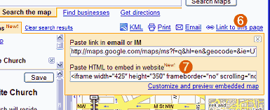
    steps 6 and 7 of embedding a google map

    Step 6:
    Click on the “Link to this page” link.
    Step 7:
    Copy the stuff in the second form text field entitled “Paste HTML to embed in website” … don’t be afraid to resize the map by clicking on the ‘Customize and preview embedded map’ link – especially to make the map tall than wide to better accommodate your ‘step 5’ annotations.
    Step 8:
    Encapsulate the code in a division of your choosing for later CSS control, then either save it to an individual file that you’ll include in other pages, and/or paste it into your directions page – NOT YOUR CHURCH’s FRONT PAGE.
    Remember, this is a Ajaxy-Javascript type of thing, adding this to your front page means you potentially create delays for first time visitors, and or blank boxes if/when the service gets overloaded.
    Also, WordPress users, I might suggest using a plug-in as the editor breaks badly when embedding such iframes – unless you disable the visual editor via your user profile.
    Step 9:
    Test the map from as many different browsers as possible.
    Step 10:
    Collect metrics to see how effective this all is.

    That’s it. And heading my advice in step 8 – you can see an example of it on my website over on a separate ‘direction example‘ page I created for this mad experiment.

    Your mileage will obviously vary, so leave a comment and lemme know how it goes.

    In the meantime, some additional bloggery on the topic:

  • 5 to ways permanently redirect an old church domain name to a new domain name

    It is no sin for a church to change their domain name. However, it is an unspeakable Internet offense if you do not provide visitors – and search engines – with a quick, simple and painless redirect from the old domain to the new. Unfortunately not all church webmasters know even 1 way to avoid said sin, let alone 5; that is until now:

    While I was surfing about for candidates on another topic, I came across the home page for the Vestavia Hills United Methodist Church of Birmingham, AL … or at least what I thought was the home page.

    Actually, I’m thinking it was the old home page, or a home page whose sole purpose is to redirect visitors from vhumc.org to vestaviahillsumc.org – but does so in a way that gets in the way of seekers and search engines alike.

    To that end, I’ve taken the time to demonstrate five different methods of implementing a search engine friendly, permanent redirect from the old domain name to the new – and in most cases, passing along any query string that may be the result of an old bookmark:

    1. mod_rewrite (via .htaccess)
    # The most preferred, but also at time the most difficult of approaches
    # requiring you modify your .htaccess file as follows:
    RewriteEngine On
    RewriteCond %{HTTP_HOST} ^(www.)?vhumc.org$ [NC]
    RewriteRule ^(.*)$ http://vestaviahillsumc.org/$1 [R=301,L]
    2. Perl:
    #!/usr/bin/perl -w
    # some might argue that this is the most difficult method, and
    # I might tend to agree as a n00b might find out that they should NOT
    # delete the blank spaces and line feeds in between the quote {} tags.
    #
    use strict;
    my $q = ($ENV{'QUERY_STRING'}) ? "?".$ENV{'QUERY_STRING'} : "";
    print qq{Status: 301 Moved Permanantly
    Location: http://www.vestaviahillsumc.org/$q\n\n};
    exit;
    3. ASP classic
    ' # yes, I know we live in the age of .NET, but if you note, today's subject
    ' # is redirecting to an .asp kinda host, so it could be the same for their
    ' # old domain.
    < %@ Language=VBScript %>
    < %
    qs = ""
    if(Request.QueryString.Count > 0) qs = "?" & Request.QueryString
    Response.Status="301 Moved Permanently"
    Response.AddHeader "Location", "http://vestaviahillsumc.org/" & qs
    Response.End
    %>
    4. PHP
    < ?php
    // # perhaps the easiest and most reliable solution for most of you out there
    // get querystring - if it exists
    $q = empty($_SERVER['QUERY_STRING']) ? "" : "?".$_SERVER['QUERY_STRING'];
    // Permanent redirection
    header("HTTP/1.1 301 Moved Permanently");
    header("Location: http://vestaviahillsumc.org/".$q);
    exit();
    ?>
    5. JavaScript
    <script type="text/javascript">
    /*
    # I don't prefer this method as most search engines won't get it, still
    # it is sometimes the only solution a limited webmaster can muster on
    # a limited budget and hosting situation.
    #
    # Also note we don't merely assign a value to href, there is a good reason
    # for this explained here:
    # http://andylangton.co.uk/articles/javascript/javascript-redirect-scripts/
    */
    var qs = window.top.location.search.substring(1);
    qs= (isEmpty(qs) ? "" : "?" + qs);/* capture query string */
    location.replace('http://www.vestaviahillsumc.org/' + qs);
    </script>

    As you can see, there’s more than one way to skin the old redirect cat. Of course there is also more than one way to foul this all up, which is why I’m providing you with a list of additional reading references just in case you find you’ve caused irreparable harm to your website and reputation the above examples as is (note, you’ve just been warned with my disclaimer):

    That said, if you’re still pondering which method to employ, here are my rules of thumb regarding which redirect method to use in which order:

    1. If you have shell access and the know-how:
      .htaccess (mod_rewrite)
    2. If you can’t do it .htaccess
      php
    3. if you can’t do it PHP
      Perl
    4. if you can’t do it Perl
      javascript
    5. if you can’t do it Javascript
      meta tag
    6. if you can’t do the meta tag
      hire some help

    Oh and for those of you who note that I didn’t include a “how to redirect using the refresh meta tag” – it’s because one of the objectives in this exercise is to redirect to preserve search engine visibility and ranking. The unfortunate abuse by spammers of the taggery means potentially hiding your lamp beneath a basket due to no fault of your own.

    For more information on how to modify the .htaccess file to redirect domains can be found here:

    Still interested in reading more on the topic of redirecting from old domains to new domains? Want to see where I got and/or vetted some of my solutions?

  • How to stop a run-away cron job

    Earlier this morning, I got a panicky email from a friend whose hosting provider made a boo-boo, launching a CRON job to perform an automated backup every minute instead of once a day. OOPS! While sorta funny, the situation was potentially sorta serious. Here’s the advice I suggested to ‘bash’ the run-away job(s) dead as a doornail:

    Step 1 – stop the cron daemon

    Linux has the ability to start and stop background services on the fly. Known as daemons in *nix parlance, the cron service runs once a minute. So step number one is to stop the cron daemon:

    $ /etc/init.d/crond stop

    or

    $ /sbin/service crond stop

    Which version you’ll employ depends on which version of Linux you’re running, but for clarity, I’ll continue on with the ‘/etc/’ flavor for the rest of this post.

    You can check to see the status of the daemon with the ‘status’ command:

    $ /etc/init.d/crond status

    Step 2 – Remove the errant crontab entry

    First understand that merely removing the errant crontab entry will not kill any run-away jobs currently in process. It will however prevent future jobs run running again. Some might suggest crontab -r … but that’s the sort of nuclear option I’d rather not resort to unless all else fails.

    We’ve discussed modifying contab before, which for most of you is a task that has been somewhat ‘de-geeked’ by means of various command consoles such as cPanel and Plesk.

    However, when dealing with run-away process – it might not hurt to know how to modify crontab from via the shell/command line as HTTP services (e.g. your web-based admin screens) might be unavailable.

    Step 3 – Identify the run-away process

    So far, we’ve been working in the realm of ‘relatively safe.‘ But killing a process, that’s one sure way to shoot one’s foot clean off – so proceed with caution.

    If this is beginning to become all too much for you, it is at this point you can reboot the server and let it do the rest of the dirty work.

    For the brave, caution means enumerating all the active/running processes with as much information possible. On a SUN, that would be ps -ef, on Linux ps aux.

    Of course these commands can potentially list dozens, if not hundreds of processes, so the trick is to limit the results, piping them through grep to filter only those jobs you want/need to see.

    The results should include the process id (PID) of the offending process – and if you’re good with your grep – any related (parent) processes. With that PID, you then use the kill command to wack the runaway process good’n’dead. Here’s an example:
    bash-2.05a$ ps aux | grep “mywebsite”
    mywebsite 11666 0.0 0.2 2444 1344 pts/2 S 23:43 0:00 -bash
    mywebsite 12451 0.0 0.1 1700 604 pts/2 R 23:50 20:00 mybackup
    mywebsite 13074 0.0 0.1 2660 760 pts/2 R 23:50 0:00 ps -aux
    mywebsite 13075 0.0 0.1 1700 604 pts/2 R 23:50 0:00 grep mywebsite
    bash-2.05a$ kill 12451

    BTW, kill -9 can be used to forgo the graceful exit and just kill the process
    now (e.g. do not stop at go, do not collect $200, just drop dead).

    4 – Restart the crontab daemon

    $ /etc/init.d/crond restart

    Disclaimer

    While the above steps worked fine for said friend (no, I’m not ‘said friend’), please note that with any such online advice, such advice, your command-line syntax, results and mileage may vary. Meaning, I disclaim any responsibility of you entirely submarine your system.

    Still, I wanted to document this … just in case …

    … yeah, isn’t that reassuring?-)

  • George Orwell: 12 blogging tips

    According to George Orwell, a scrupulous blogger, in every sentence they write, should ask if their words and images attain their site’s conversion goals. If not, then perhaps there are some instances of Spurgeon-esque church-speak and/or kitschy imagery and cliches getting in your reader’s way.

    For those of use who graduated high school before 1984, we remember with both eager anticipation and fearful foresight the George Orwell classic of the said year. A book that not one of my friends, nor I, could put down once started in part due to Orwell’s crisp, concise and to-the-point power-writing on such an important and always relevant topic. A style of writing nicely summed up by an article on WritingClasses.com entitled ‘George Orwell: 12 Writing Tips.’

    The above article, quoting from essay ‘Politics and the English Language,’ reformats Orwell’s points in a way that should speak to bloggers and church webmasters alike:

    A scrupulous writer, in every sentence that he writes, will ask himself at least four questions, thus:

    • What am I trying to say?
    • What words will express it?
    • What image or idiom will make it clearer?
    • Is this image fresh enough to have an effect?

    And he will probably ask himself two more:

    • Could I put it more shortly?
    • Have I said anything that is avoidably ugly?

    But you are not obliged to go to all this trouble. You can shirk it by simply throwing your mind open and letting the ready-made phrases come crowding in.

    Similarly, for those of you providing compelling content for your church, charity and/or lay ministry, ask yourselves this:

    • What is my organization trying to say?
    • What are the shortest number of words we can use to express this message?
    • Are there any images, either in metaphor or media that will speak 1000 words?
    • Is this picture I’m trying to paint relevant and fresh enough to meet our site’s conversion goals?

    Not sure? No problem, in the same document Orwell also leaves us with some rules we can employ to provide more compelling content on our blogs, websites and emails:

    • Never use a metaphor, simile or other figure of speech which you are used to seeing in print.
    • Never use a long word where a short one will do.
    • If it is possible to cut a word out, always cut it out.
    • Never use the passive where you can use the active.
    • Never use a foreign phrase, a scientific word or a jargon word if you can think of an everyday English equivalent.
    • Break any of these rules sooner than say anything barbarous.

    If this is still all unclear to you, then allow me to redirect your attention to the following action items, in order:

    1. consider the conversion goals of your website – what are you trying to get the reader to do when done reading your stuff?
    2. knock-off the church speak – speaking in TBN-ish platitudes may preach to the choir, but may also be painting an irrelevant and confusing pictures to potential congregants.

    If all else fails, just remember this tried and true adage: “You’re not Spurgeon, quit trying to write like him.

    Oh and finally, a big hat top to Kevin Pierpont who turned me onto these tips on his blog. Yes folks, it pays to aggregate!