Category: Bad Design Posters

  • Is Church marketing dead? Nope, just stuck on stupid!

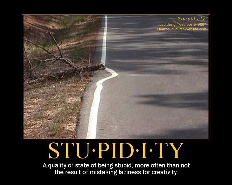
    Bad church web design poster 007 - Stu·pid·i·tyThere’s no getting around it, despite the efforts of many to teach, rebuke, correct & train in righteous web design, there still exists a great cloud of witlessness when it comes to the Church’s presence online. A fact painfully corroborated by the persistent body of ‘kitsch‘ out there that distracts, annoys and otherwise drives-away people seeking and/or serving the Lord.

    WHOOOOSH – flame on!

    I should know, as I’ve been engaged in mental combat with these forces of evil web design idioms since the turn of the new Millennium, first in collaborating with Vincent Flanders on his second book, an act which lead to the eventually May 2002 establishment of Heal Your Church Website.

    But enough of my credentials, lest I start this post start sounding like a Pauline epistle, though I should probably mention that I do the software as a service thing for a living … but that’s plenty about me, as others equally qualified have since dashed headlong into the breach.

    This would include Cory Miller and James Dalman at Church Communications Pro (CCP), the latter of whom begged the all important question: “Is Church marketing dead?” Specifically, pondering aloud:

    There is something going on but I quite can’t put my finger on it. It’s a gut feeling that’s right more often than not. I think the church landscape is drastically changing and that church as we know it now is going to evolve (no, I am not supporting Darwin) into something much different. It’s just a hypothesis or idea I’m working on, whatever that’s worth.

    To which my response is: “James, let me save you a few steps. Church marketing isn’t dead, it’s just stuck on stupid!

    If that weren’t the case, why would sites and services such as CCP, Church Marketing Sucks, For God’s Sake Shut Up, and a handful of others continue to, and with apologies to Vincent Flanders, offer weekly lessons in good church marketing by looking at examples of bad church marketing?

    I mean, how many examples of church websites adorned with the cliché gold lamé animated gif of a spinning cross that screams “everything I know about website design I learned from Strong Bad!“ do we need to ‘Fisk‘ to make our point?

    Or on a more serious note, how many of us seen all to many unique local churches dive through the porpoise-driven hoops of Warren-ology just to become different like everyone else?

    And that’s really my point, it’s not that church marketing is dead, it is that we’re stuck on driving down the wide and easy path to church marketing, rather than seek out a difficult path that includes:

    • Studying Scripture to see where marketing and evangelism intersect;
    • Teaching lay staff and church on what real marketing is and how it works;
    • Understanding that the Church didn’t start in 2000, but rather 2000 years ago;
    • Putting aside the need to agree 100% with everyone 100% of the time;
    • Initiating marketing teams as opposed the message controlled at a single point;
    • Daring to be different without amputating one’s self from the Body.

    Look, we have centuries of beautiful sacred songs, art and literature as the result of the artistry that was once the Church’s … why can’t we have the same for church marketing in the 21st century?”

    Or put another way, Franky Schaeffer was right when he asserted that Christians are no longer influencing society through various forms of media, but are instead influenced BY it. A neat trick when you think Francis Shaeffer’s son warned us about this as far back as 1981!

    WHOOOOSH – flame off!

    Oh, and before I forget, to my Eastern Orthodox friends … a belated Χριστός Ανέστη!

  • How to avoid high maintenance church website design

    High Maintenance: Lamborghini v. Mommy VanFor what will it profit a man if his church website is the slickest in the Internet if he has to forfeit a month’s collections just to change the welcome message?

    If you haven’t guessed by the play on Matthew 16:26 (&/or Mark 8:36, &/or Luke 9:25), or the somewhat wordy “bad church web design poster #006,” the topic of today’s “sermonette” is website maintenance.

    You see, there’s a dirty little secret that professional web developers such as Tim Bednar, Mike Boyink, and myself have known for years:

    Creating and designing websites is alluring and hi-profile work – whereas maintaining code and a consistent stream of compelling content is difficult and is about as glamorous as the janitor who keeps the church toilets clean.

    A point made all the more sharper, like a pointy stick in the eye sharper, when you fall into the trap of having that college kid studying home on spring break create for a really super-click Flash-based church website that everyone – and only – those in his age group and demographic can ‘really appreciate.’

    Then the train wreck occurs sometime in early October when said student is back at art school and your poor church Secretary has to post updates from those in the field on summer mission programs.

    Sound Familiar?

    If not, just give it time. Since 2002 when I started out on my crusade to teach, rebuke correct & train others in righteous web design I’ve seen literally hundreds – perhaps thousands – of church websites that went down this path to obscurity and frustration.

    And this is why we find churches equipped with data-driven content management systems, or at least driven-by a reasonable blogging system, providing pages with excellent search engine rankings and the visitors and conversion rates to show for it.

    Sound Good?

    Okay, so if I’ve sold you on the concept that maintenance is the key to a successful online ministry, then perhaps then I can also convince you and/or your church to engage in the following processes to keep it going for years and years even though your resources are tight and your time tighter:

    • Establish a web ministry team comprised of the following mix of talents:
      • a member of the church staff
      • a software developer type
      • a hardware geek
      • a graphic artist type
      • a word-smith
      • a marketeer
    • Consider employing a content management &/or a logging service to render your church website such as:
    • Engage in a formalized design process before writing a single line of HTML/code that includes:
      • reviewing what’s out there
      • understanding your neighborhood
      • setting attainable goals and objectives
      • establishing minimum requirements
      • defining an informational architecture
      • creating a project plan
    • Execute a development plan that includes the following steps:
      • designing a prototype
      • soliciting user feedback
      • building the system
      • testing functionality
      • testing use cases
      • testing loads and bandwidth
    • Follow-up with a maintenance plan that includes:
      • user education
      • staff training
      • analysis of web analytics
      • data & system backups
      • disaster recovery drills
      • security audits
      • error-log reviews
      • checks of search engine ranking
      • software upgrades
    • Security ongoing success with:
      • rotating in/out new members to your committee;
      • occasionally testing new applications and technologies;
      • periodically soliciting feedback from seekers and church members;
      • make sure there’s a line item in the church budget for the website.

    Sound Too Hard?

    Now if you’re panicking a bit over some of the items above – don’t sweat it. If you’ve took my advice to create a team that includes both a hardware and software geek, you’re good to go on those issues like “use-case testing” or “disaster recovery drills.

    And if you’re too small to do the above – again, don’t sweat it – simply figure out what you can do from the above list with what you’ve got, never forgetting that putting up a website is easy – it’s the maintenance that’s a killer.

    For which of you, desiring to build a tower, does not first sit down and count the cost, whether he has enough to complete it? Otherwise, when he has laid a foundation and is not able to finish, all who see it begin to mock him, saying, ‘This man began to build and was not able to finish.’ Or what king, going out to encounter another king in war, will not sit down first and deliberate whether he is able with ten thousand to meet him who comes against him with twenty thousand? And if not, while the other is yet a great way off, he sends a delegation and asks for terms of peace. So therefore, any one of you who does not renounce all that he has cannot be my disciple. – Luke 14:28-33

    (psst: oh yeah, in case you didn’t figure it out, you click on the small image of the poster above to get to the really-big version you can print out and nail to the door of your church)

  • Inaccessible, that’s what you are

    I find too many church and charity websites putting their best information out of reach. Hence the idea driving today’s bad church web design poster is best sung to the tune of Nat King Cole’s classic, “Unforgettable,” followed by my usual ‘snarkastic‘ enumeration of this pesky issue:

    Inaccessible, that’s what you are
    Inaccessible so near, yet so far
    Like a hy-per-link that eludes me
    How the four-o-four page so annoys me
    Never before has one suffered more

    Heal Your Church Website bad Design Poster #5: Inaccessible

    Inaccessible in many ways
    And forever more, that’s how it stays
    That’s why, ad-min, it’s incredible
    That something so intolerable
    Thinks that I am intolerable too

    <instrumental interlude>
    No never before
    has one suffered more ooh

    Pretty corny? You becha! Pretty common, absolutely. In fact, when it comes to accessibility and church websites – I think the out-of-reach bag of chips pictured in the poster photograph sum up the frustration often felt by many seekers who visit church websites, only to loose their cents and their sanity selecting options that take them nowhere.

    In other words, though most talks of web accessibility are often limited to those topics covered in Mark Pilgrim’s seminal “Dive Into Accessibility” — I would like to expand the conversation today a number of examples where I find church webmasters needlessly impairing their users in the following ways:

    • Bed and breakfast markup
    • Employing browser-specific navigation
    • Charging a fee to read sermons and/or Bible studies
    • Not thinking through the information architecture of the website
    • Displaying Flash content with no browser detection and alternative content

    Bread and BReakfast!

    ‘B and BReakfast markup’ is a handy mnemonic mechanism to memorize how not to semantically collude your online sermons and studies with misused taggery such as < b > and < br >.

    There’s enough existing (x)HTML taggery out there to make your markup match the meaning of your message. Trust me, you’ll thank me for this when you eventually publish a book and/or study guide based on your blogged sermons.

    I write about this in some detail though recent improvements in better-written blogging and CMS applications are making this less and less an issue over time.

    Browser-Specific Navigation

    Here I’m describing those instances where someone employs something like those nifty cool slide-in, drop-down, tree-expanding menus that only work on Microsoft Internet Explorer.

    Or just as evil, uses a DuHtml menu whose sub-choices require the lightening fast reflexes of an over-caffeinated super-hero to click before they disappear.

    Charging for Sermons

    I had actually received an email on the topic – but lost the link (bad dean, bad!). None-the-less, my point is, sermons, Bible studies and other such “opium content” are critical elements that those shopping for churches online use to gauge whether or not they’re going to visit a particular church on Sunday.

    More on this in my post “Is your church website little more than brochureware?

    Information Architecture

    Also known as your informational hierarchy, your navigational hierarchy, your navigation tree and/or your site map.

    This rose by whatever name needs to be well organized enough for the average Joe or Jane to figure out.

    Yes, it means putting down the mouse and thinking first then coding – but it is well worth it as categorizing information enhances church website conversion goals.

    Flashination

    About the only thing more annoying to me than the spinning .gifs of gold lamé crosses on ‘KJV only’ church websites, are Flash-based church websites – or heavy Flash use church websites – that provide no alternative content for those who have not installed the latest and greatest Flash reader plug-in; and/or just don’t view Flash due to restrictions of work, bandwidth and/or physical disability.

    I write on this over-used and/or poorly implemented media all too often here to cite a singular article … so does Vincent Flanders who defines the practice ‘flashination‘ in a slightly more adult parlance.

    Betcha can’t eat just one

    Bottom line is, having inaccessible content is about as frustrating as offering a person a single Lay’s potato chip – whereas making things easy to reach and read is like providing them a sumptuous feast of data that will keep them coming back for more.

    The choice is yours.

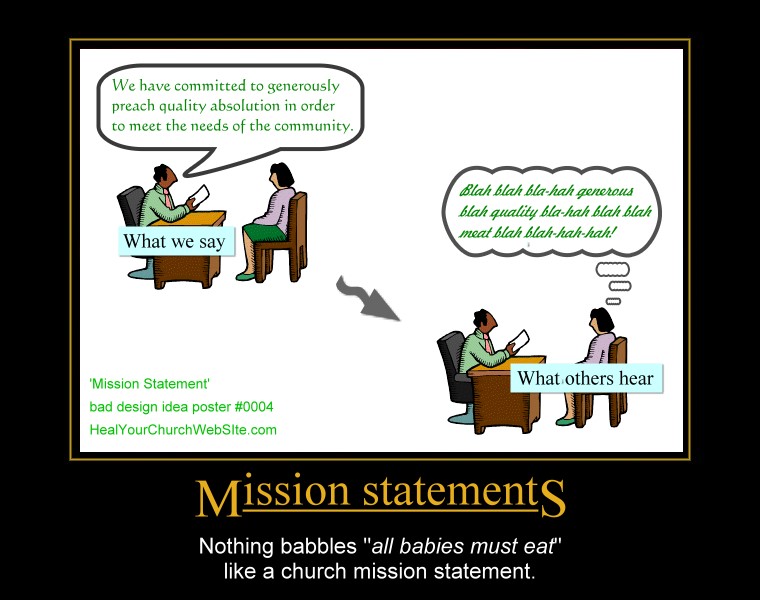
  • Bad church web design poster 0004 – Mission Statements (suck)

    Programmer guru Joel Spolsky reminds us that usability tests often demonstrate that very few users read the words you put on screen. Couple this the fact that 1-in-3 users are un-churched, and I’d venture to say that Nielsen is right – just about nobody reads nuthin’. Instead like wild animals, they just hunt it, scan it, and categorize it in their pretty little pumpkin heads and move on.

    Or as the good Dr. writes in his latest alert box entitled “Blah-Blah Text: Keep, Cut, or Kill?“:

    Introductory text on Web pages is usually too long, so users skip it. But short intros can increase usability by explaining the remaining content’s purpose.

    Which all leads me to yet another addition to our growing gallery of bad church website design posters, this one entitled “Mission Statements:”

    For those of you who didn’t figure out that clicking on the thumbnail above gets you to ‘the big picture,’ – this poster basically preaches a lesson shouted from the mountain tops by Father Flanders that asserts:

    “[Mission statements] should be abolished because every Mission Statement ever written can be summarized in four words — ‘All babies must eat.’”— Vincent Flanders, author of Son of Web Pages that Suck

    Or to paraphrase Coding Horrors’ Jeff Atwood – replacing the term user and software to our advantage:

    My intent is not to make fun of [church goers and/or seekers], but to illustrate that there are far more effective ways to communicate with your dog. Essentially, any time you’re asking [a visitor of your church website] to make a choice they don’t care about, you have failed the [visitor]. Well designed [church websites] takes care of “[Christianese or church-speak ]” all by itself, and leaves the [seeker] free to worry about things relevant to the [information they seek].

    And for you fans of Gary Larson’s Far Side who recognize the inspiration for my poster, Mr. Atwood also has in the same article I just mis-quoted, an example of “what we say to dogs … vs … what they hear.

    Once again, as a living reminder of not-so-intuitive design, you click on the small poster to see the full-sized version, but please, no hot-linking without providing a link back here to the article – not just the pix.

  • Bad Church Website Design Poster #0003 – Pretentious

    click here to see the full-sized, 760x600 version of Bad Church Website Design Poster #0003 - PretentiousNothing shouts at a potential visitor ‘your time is NOT important to us‘ than making them have to wait for a pretentious Flash intro … especially those renderings so gratuitous that they include a ‘skip intro’ link. Here’s why:

    I think Vincent Flanders sums it up best on his page entitled ‘Biggest Mistakes in Web Design 1995-2015‘ when he opines:

    “… there’s a tendency to misuse Flash and because of space I can’t go into every detail. Nevertheless, here’s a perfect example …

    You have to watch a boring, soundless, twenty second flash intro with no option to skip it …

    Putting a ‘Skip Intro’ button on the page. Of course, we all realize that a ‘Skip Intro’ button signifies that the content on the page is worthless.

    Good Web designers only put content that must be viewed on a page. By giving them the option to skip this material, you’re saying it’s not worth seeing. If it isn’t worth seeing, why do you have it on your site in the first place?”

    Emphasis mine, but I’ve dialoged enough with Mr.Flanders to know that if anything, I haven’t emphasized the concept of worthless Flash animation enough.

    Look at it this way: what would happen if you were visiting a new church for the first time, only to be halted at the door, made to wait for the ‘greeter’ to set-up and load his portable DVD player, to make you watch a video of fly-in slogans, church-speak and content the equivalent to a DIAL Soap commercial?

    Yeah, any wonder why the Waffle House down the street is selling so many omelettes this morning? Probably because they don’t make people hungering wait to watch a video on the wholesomeness of the edible egg.

    Folks, your church website isn’t a stinkin’ art project. Nor is it MTV, nor is it a used-car concession. Quit treating like it is with the gratuitous, pretentious Flash introductions.

    There are plenty of other legitimate opportunities to employ Flash, putting it at the front door isn’t one of them.

    Yes, you click on the small poster to see the full-sized version, but please, no hot-linking without providing a link back here to the article – not just the pix.

  • Bad Church Website Design Poster #0002 – Kitsch Art

    Kitsch /kɪtʃ/ is a term of German/Yiddish origin that has been used to categorize art that is considered an inferior copy of an existing style. The term is also used more loosely in referring to any art that is pretentious to the point of being in bad taste, and also commercially produced items that are considered trite or crass1.

    bad church web design poster #0002 - kitch artKitsch is the term that comes to mind whenever I see cheap, cheesy clip-art gratuitously grafted into a church website.

    Sorry folks, but nothing conveys the antithesis of a rich worship experience than to see a website cluttered with Christian cruft in the form of spinning crosses, low-res icons and cliches art.

    As always, you can click on the small image to see the big image.

    As always, please no hot-linking w/out providing a link back here (to the article, not just the picture :-).

    And as always, I welcome comments, in love, if you have an idea, suggestion and/or … um … comment.

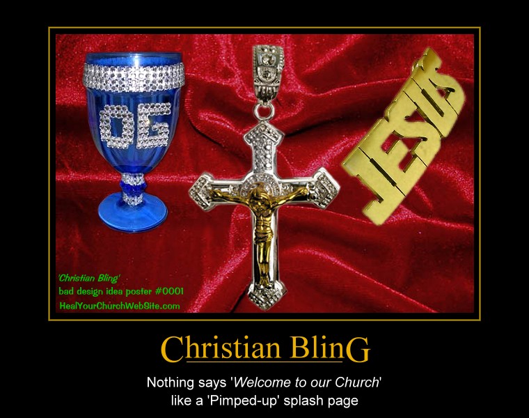
  • Bad Church Website Design Poster #0001 – Christian Bling

    A new category for a new teaching toy – er, I mean tool: Bad Church Web Design Posters. Today’s entry:

    “Christian Bling” – or – “Nothing says ‘welcome to our church’ like a ‘pimped-up’ splash page.”

    thumbnail of bad church web design poster #00001

    Click on the small image to see the big image.

    With this poster’s release, don’t let me catch any of you with rhinestone crosses spinning on a splash page – then again, if you’ve been reading my blog, you’ll know that you shouldn’t even have a splash page, or as Vincent Flanders aptly put it in a January 2001 ibizInterview:

    Wal-Mart doesn’t block the entrance to its stores by making you watch a movie or make you listen to someone who explains the history of the company. That’s what a splash page does. It blocks your visitor from getting to the meat of your site. Also, certain search engines give a higher ranking to the contents of your root page (where the splash page is located) and splash pages rarely have any information. A splash page can hurt your rankings with a search engine.

    Oh, and please, no hot-linking w/out providing a link back here (to the article, not just the picture :-).