Tag: usability

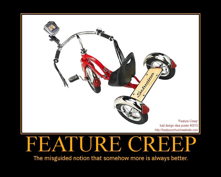
  • Bad idea design poster #10 – Feature Creep

    The misguided notion that somehow more is always better.

    • Main Entry: Feature Creep
    • Pronunciation: /fee-cher,kreep/
    • Function: intransitive verb
    • Etymology: Middle English feture crepen, from the act of over-building something
    • Date: December 24, 2009

    Remember folks, flee from temptation to ‘gizmo’ up your site.

    The misguided notion that somehow more is always better.

    Instead, focus on workflow – that is the things your users want/need to do/learn from visiting your website.

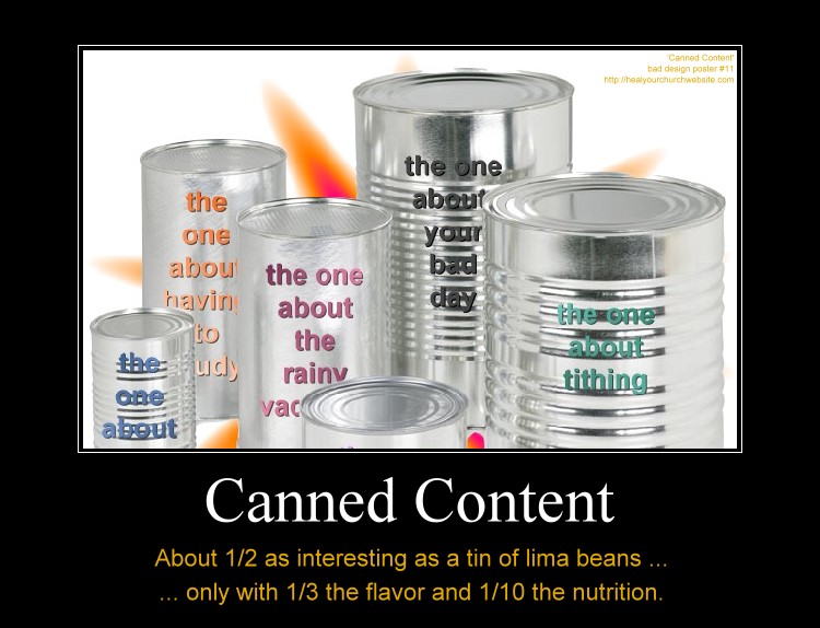
  • Bad idea design poster #11 – Canned Content

    One of the things myths I’ve heard from attending my share of  Word Camp Raleigh events is that template systems are somehow a magic bullet to a successful online marketing campaign.

    Canned Content, about 1/2 as interesting as lima beans with 1/3 the taste and 1/10 the nutrition.

    Not that there’s anything wrong with terrific tools such as  Thesis, Headway, Genesis, and Builder; nor the premium themes one can purchase for them.

    Rather I’m hoping that along with the discussion of getting a fast start with premium framework themes and plugins that we also remember what usability guru Jakob Nielsen said about ‘Information Foraging‘ back in 2003 when describing how to catch and keep visits from data hungry first time visitors:

    The two main strategies are to make your content look like a nutritious meal and signal that it’s an easy catch. These strategies must be used in combination: users will leave if the content is good but hard to find, or if it’s easy to find but offers only empty calories.

    Basically, Nielsen is detailing how to attaining user-activity goals through the careful crafting compelling content and the navigation to it – known in the web strategy/analytics world as a ‘conversion funnel.

    So it is my hope that amid discussions on how to make our blogs look  ‘different like everyone else’ via various rendering engines, that we also take some time to talk about how-to develop a sensible information architecture that best suites the goals of your church and/or charity.

    Put another way, we need to remember that if  “Web users behave like wild beasts in the jungle …,” then we probably want to avoid taunting such ‘Informavores‘  with ‘canned content’  when in fact only raw meat will satisfy their hunger.

    In other words, just because a number of the speakers are justifiably and understandably using this conference as an opportunity to sell their template and plugin wares – it shouldn’t be to the exclusion of those in attendance whom are seeking help with all the other aspects that go along with establishing an effective web presence.

    Meanwhile, if you’re headed into town, let me know. If you can’t make the event, keep in mind that there’s a “SitePoint Podcast coming to WordCamp Raleigh.”

  • 12 Days of Jesus Junk – Day 5 – Speak Clearly

    Even if you haven’t read the latest writings of Steve Krug, Jakob Nielsen or Luke Wroblewski, it doesn’t take a ‘Rocket Surgeon‘ understand the wisdom the “duck test” which according to the all-knowing Wikipedia asserts:

    If it looks like a duck, swims like a duck and quacks like a duck, then it probably is a duck.

    Which is why I find myself  a little bit confused when stumbled onto the  ‘Jesus Christ Celebriduck Limited Edition Collectible Rubber Duck‘ parodied in the instructional poster below:

    12 Days of Jesus Junk - Day 5 - Speak Clearly

    Call me old school but as I recall a rubber ducky is, as Ernie of Sesame Street so aptly described in song a “ .. little fella who’s Cute and yellow and chubby …

    Now I know what some of you are thinking “Dean, you dope, the Celebriduck is a collector item thing … of course it doesn’t look like a duck!” …

    … kidding aside, I already figured out it’s some niche merchandise marketed who also speak other arcane dialects such as “Beanie Baby” … but that gets to my point!

    Using insider jargon-eze is a sure fire way to relegate your website the non-desirable’ SEO’ known as ‘search-engine obscurity.

    Consider this:  in the U.S. 1 in 3 adults is unchurched. Meaning 1 in 3 adults don’t understand the ‘church-speak‘ that bables-up and out of expensive color brochures, sermon videos and web sites.

    So when it comes to the purpose and personality of your organization, speak clearly and say it plain. Tell visitors precisely what THEY seek in terms THEY understand.

    Put another way, by avoiding ‘clique chat‘  you’ll not only make your site more usable to individuals trying to find what you have to offer, but you’ll also help avoid spending $5k on a Search Engine Optimization (SEO) expert.

  • 12 Days of Jesus Junk – Day 4 – Unreadable at 11:23

    Even though I’m a software guy, I think if I were asked to design a religious-themed wall clock I might steer clear of some of the usability issues I find with the Jesus Christ Carrying Cross Christian Theme Wall Clock parodied below:

    12 Days of Jesus Junk - Day 4 - Unreadable at 11:23

    What usability issue? Well if I’m a user sitting across the room at 11:23, and possibly at 4:55 and 8:05, I might find it hard to see what time it is because of the dark black lines of the artwork create a dark black background for the thin black arms of the clock.

    So what has this got to do with my church or charity website? Glad you asked.

    What we want to take away from today’s example is the concept that part of a successful user interface isn’t just design that looks good (not that I find the clock artwork all that inspiring) — but also a design facilitates a positive and productive user experience.

    This can be measured in ‘conversion rates,’ that is the rate at which the user successfully uses the website (or clock) to accomplish some item of work or information gathering.

    This means we need to avoid design elements get in the way of a web page’s core functionality, otherwise we’re left with the antithesis of conversion – the user abandons the product – often quantified as the ‘bounce rate.

    To help avoid this common pitfall, I offer this “fast five” lists of things to remember when designing a webpage:

    1. You are not your user;
    2. solve their problems, don’t burden them yours;
    3. don’t assume all any of your users are idiots;
    4. engage in user testing – where non-geeks attempt simple, common tasks; and
    5. when a problem and/or encumbrance by a user is reported – do what it takes to provide the user a clear path to operational/work-flow success.

    On that last point, think Amazon.com, the premier example of conversion goals in action. When they hear of something that gets in the user’s way – even if it sounds stupid – they fix their site to accommodate the customer.

    I’d recommend doing the same, perhaps starting with some good-old-fashioned hallway testing and moving out from there.


  • 12 Days of Jesus Junk – Day 2 – Think Globally!

    As once again the  TSA reminds us that Christmas Snow Globes a threat to National Security, I thought it might be a good time to talk about the wide-World of bad-guys and some simple things you can do to guard your site from a potentially explosive situation.

    12 Days of Jesus Junk - Day 2 - Think Globally

    Unlike the 5.5″ The Kneeling Santa Claus Musical Christmas Water Globe parodies above, there are some real threats to your website that are an unfortunate aspect of the “World Wide” nature of the Web.

    Specifically, I’m talking about the army of professional hackers employed in far flung regions such as China, Nigeria and of course what is now the former U.S.S.R.

    For that, I recommend a modification to your  .htaccess file such as:

    <Limit GET HEAD POST>
    deny from 218.25.161
    allow from all
    </LIMIT>

    If you look close, I’m only using 3 levels of the IP address to 218.25.161.0 through 218.25.161.255.

    And where does one get a block of  IPs to block? Glad you asked …

    Pre-fabricated blacklists to block IP addresses of entire countries:

    A bit more on .htaccess and mod_access:

    Just remember to keep good backups of whatever files you’re working on – and try not to lock yourself out while experimenting with changes!

  • 12 Days of Jesus Junk – Day 1 – Hallway Testing

    I’m sure the makers of the Gemmy 6ft Airblown Inflatable Christmas Nativity Scene parodied below were not trying to assert that Jesus was of Aryan descent:

    Avoid accidental message myopia by subjecting all your design work to hallway testing

    So how do we avoid the type of ‘accidental-message-myopia‘ that produces a design that includes a not-so Middle-East,  blond haired (and possibly blue-eyed)  baby Jesus?  Two words “Hallway Testing.”

    The Wikipedia describes hallway testing as:

    Hallway testing (or hallway usability testing) is a specific methodology of software usability testing. Rather than using an in-house, trained group of testers, just five to six random people, indicative of a cross-section of end users, are brought in to test the software (be it an application, web site, etc.); the name of the technique refers to the fact that the testers should be random people who pass by in the hallway. The theory, as adopted from Jakob Nielsen’s research, is that 95% of usability problems can be discovered using this technique.

    In short, hallway testing is the simple act of accostingI mean drafting … I mean enlisting 5 or 6 random individuals to inspect your designs to insure among other things, you’re not overlooking some detail great or small that accidentally sends the wrong message.

    I know it’s an extra step in the web design process, but when one considers alternatives as the above parody poster depiction, it’s probably worth it.

  • 5 Things that heal your church website

    Last Friday I posed the question “what actually heals a church website?” Now it’s Tuesday and I’d like to talk about this in light of the many excellent comments received.5 remedies to heal your church website

    But first a BIG THANKS to all who participated in this dialog – this was both good and healthy and it is much appreciated.

    1. If it’s broke, please fix it

    “The medicine that heals depends on the illness — if you’ve got a spinning gold cross, removing it becomes job #1” – Mickey

    It’s such a simple point, yet a very salient one. There are some very obvious maladies that afflict our church websites. When we see them, we should fix them.

    For those who don’t know what I’m talking about, I prescribe my post entitled:

    Even if you do know what I’m talking about, it’s a fun read … don’t worry, we’ll be here when you get back.

    2. If it ain’t broke, don’t fix it!

    “I fixed up my church’s website with WordPress and a user-friendly, inviting design. Within months they’d wrecked the colors, changed pictures of people to pictures of furniture, and otherwise mucked it up.” – Jeremy

    Okay, I’m not trying to be a wise-guy here, but I’ve seen this happen all to often. Usually this occurs when an individual has an agenda that it outside the scope of what the church website is trying to accomplish. Two that come to mind are:

    1. On the job training or skills advertising
    2. An ego that can’t share nice things

    Often, I find it’s a combination of the both. My post “Mr. Zeldman meet Mike Boyink, one of ‘The New Samaritans’” comes to mind.

    3. Content is King

    “Even if it has to be black Times New Roman on a stark white background, I’d say job one is relevant content. When, where, what, who, and how, and for good measure, don’t forget why.” – lemon

    I’m thinking ‘lemon’ pretty much summed it all up rather nicely with his/her enumeration of the basics that help us avoid the “Seven deadly sins of web writing.”

    4. Identify your target audience

    There are really (at least) two distinct audiences for a church website:

    1. People not part of your normal congregation, seeking information about your church …
    2. People in the congregation who want to know what’s on this week …

    Since the introduction of this  blog back on May 17, 2002 I’ve been preaching the importance of identifying the purpose and personality of your church website – and then aiming all content, controls and/or contrivances at seekers and members alike.

    Put another way, “A church website that fails to convey the purpose and personality of the congregation and staff will also fail to bring new members into the door.” – Empty Parking Lot Tabernacle

    5. Identify your process & work-flow

    “Unfortunately I think its a people problem, the site is just a symptom. People need to see it as a communication medium and commit to its use. I’m surprised at how poorly email is used by churches, let alone websites.” – David J

    Unfortunately, I think the master of the B2Blog has offered a diagnosis that is as incisive as it it accurate. David accurately points out that unless we understand the work-flow that defines how we:

    • identify things that need fixed;
    • identify things that work;
    • identify what makes compelling content; and
    • identify the target audience of your church’s purpose and personality …

    … then a church website is likely never to get healed no matter what content management system it employs, …

    … no matter how much Flash animation the site does or does not have, …

    … no matter how many social networks the church-geek API’s into the site.

    In short, unless church doesn’t have well defined processes for how to effectively get the right information out to your target audiences, then you’re efforts are like the person Paul describes in 1 Corinthians 9:24-27 as aimlessly batting at the air.

    At least that’s my take. What about you?
  • A Conference Apart – where Dean gets to meet Zeldman, Meyer & Fried!

    A ticket Apart, sign up now for your own!You bet I’m stoked! This coming October 13–14, 2008, I’ll get to rub usability elbows with Eric Meyer, Jason Fried, Jeffrey Zeldman, along with several other web standards rock stars at the An Event Apart 2008 conference held at the at the Sheraton Chicago.

    Along with annoying you with bloggery over meeting my UI idols, there I’ll gain a deeper understanding of web standards and emerging best practices. Be inspired by fresh ideas and new directions. Join the greatest minds and hottest talents in web design today.

    You can too!

    Sign up by September 15, and not only do you get an early-bird discount, but you can either apply a discount for a stay at the Sheraton. Or do what I did, sign-up now to insure a room at the nearby Hampton Inn at a AAA rate that’s $25 cheaper, offers free breakfast, and most importantly – FREE WIFI (whoohoo!)!!!!!

    Moreover, your conference pass includes admission to all sessions at the two-day Chicago conference, snacks and lunch on both days, access to all social events, and a bag of schwag … and most importantly … a chance to meet your cult leader, DEAN PETERS!

    Now if I can just convince Vincent Flanders to go so that there is an earthquake of usability genius in a solitary Chicago-based epicenter this coming October!

    Meanwhile, here’s a link to some JZ’s posts from last year’s Chicago Event Apart.