Category: Proverbs 13:13

  • Does bad theology induce bad church website design?

    Is it just me, or is there a correlation between flimsy theology and flaky web design?Doh! A site so badly design, you'd think Homer did it!

    Seriously, having reviewed hundreds of sites after sifting through thousands since May of 2002, I have to believe there is some linkage between bad theology and worse web designs.

    Case in point, “Bible Truths” which among its barrage of kitschy animated gifs and cheesy graphics, this site erroneously preaches:

    Fortunately, here’s one case where webmaster Don Martin (no, not THAT Don Martin)  obfuscates the site’s not-so-compelling content by rendering plain text with the same color as the hyperlinks (usually not a good idea, but in this case I’ll make an exception).

    Had the latter not be underlined, I may have never come up with 5 things we can learn from this FrontPage induced visual assault:

    1. Just as tricks are for kids, so too are animated gifs are for silly rabbits.
    2. If you have to say “click on the door to enter …” on the graphic link into the website’s site map, then it means the whole point of a picture saying 1000 words is lost here.
    3. Don’t use the evil marquee tag to tell people how to navigate back to the page their currently on. It distracts while potentially causing the user to ‘use your “Back”‘ button at the wrong time.
    4. Why hide the light of your site search engine under a basket? Make it VERy conspicious on EVERY page.
    5. Using images for page, sermon, lesson and other titles instead of text to represent text means said information is hidden from Google and Yahoo.

    Of course none of this matters without a theological make-over. But let’s say by some miracle it happens, then I’d also recommend the webmaster consider the following tools to better organize, maintain, and serve up said content:

    • drupal – especially leveraging add-ons for books and lessons
    • moodle – an open source application created to manage coursework
    • mediaWiki – a great tool for enumerating encyclopedic information

    So whatta you think? Leave a comment, in love!

    UPDATE 10Jul08  – after you’re done here, check out the follow-up article entitled ‘Follow-up: bad church web design inspired by bad theology.’ It might clarify some concerns or questions you have – or it just might make ya all the madder !-)

  • ‘Bab’tist Church, or FrontPage Conspiracy? You decide!

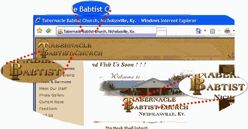
    Baptist is a term describing a tradition within Christianity that takes its name from the conviction that followers of Jesus Christ should be immersed in water as a visible and public display of their faith. I’m not sure what a ‘Bab’tist is.

    Hey folks, what do you think a seeker new to town is going to think when they visit this web site for “Tabernacle Babtist Church, Nicholasville, Ky?”

    Tabernacle Babtist Church, Nicholasville, KY

    Below is a list of a few more church web sites where the [title] and/or [h1] tags are similarly afflicted:

    Interestingly enough, I determined that more than one of the sites cited above were rendered using FrontPage. Coincidence or conspiracy? Hmmmmmm …

  • Be careful what you say in between the lines

    Ah … behold the ‘brochure-ware’ that is ‘Heritage Free Will Baptist Church of Shreveport, LA.’ that through the magic of minimalism, infers the oft heard but rarely true misnomer “… we at least have something out there …

    An oft quoted response I’ve sometimes received after reviewing a website whose healing begins with ‘rm -rf *

    A response that in the future I think I’ll from now on return with the question:

    “The ‘Yellow Pages™’ are just out there – does that mean you rush out to sloppily place a listing with an incorrect phone number or address?”

    I know it is not an exact comparison but it speaks to my point – what is your crufty “just out there” web presence saying about the purpose and personality of your church?

    click here to see larger screen shot of IE vs. Firefox page renderingsTake seriously how you describe your church to those seeking online – especially those using non-MSIE browsers; hint … hint.

    Let what you say online be more effective and evident than what you say between the lines with a web offering that has enjoyed little in attempting to understand its intended audience.

    Put another way – and yes, you can quote me on this: ‘What your church website says in between the lines is as important is what it say online.’

  • Again with the “Religion is a ‘Chruch’” – Bethel Lutheran Church

    Again with the “Religion is a ‘Chruch’” – Bethel Lutheran Church

    By virtue of the Wayback Machine Archives, here’s what I know about the web presence for the Bethel Lutheran Church of Northfield, Minnesota as of Since at least July of 2004:

    • was as some point rendered from Microsoft Word;
    • has been preaching that religion is a ‘chruch’ through it’s <title;> tag
    • employs frames for navigation, yet still requires right-frame scrolling at 800×600 for text;
    • suffers image bloat, where the web person mistakenly uses the <img> tag to resize the view of the image, without changing the physical size (and hence download time) of the image;
    • right frames have no navigation elements to get person back into frames if they happen to either pop-open a new navigation window and/or surf in from a search engine;
    • so word-stuffed, that multi-color fonts and sized are required so the important stuff can shout over the white noise;
    • navigation text on right not much different from title text – making it difficult for the 60 year old grandma to figure out that’s where to click;
    • gratuitous use of kitschy churchy ‘cheap-art;’ and of course
    • obligatory, church-speaky mission statement.

    By virtue of alot of experience, training, blah, blah, blah:

    • Why didn’t anyone see this? At least the title tag if not the cruft?!

    Here’s my point. It appears that the Bethel Lutheran does have some things going for it, namely that they have their information organization figured out.

    Likewise, and again to their credit, whomever is maintaining this site understands what they want to write to verbalize the personality of their church body. What they don’t have is a website that visually reflect this while creating some bandwidth and navigational nightmares.

    So a couple of ideas on how to fix this:

    1. Personally, I’d look into employing a blog as a form of content ‘manglement’ on the cheap;
    2. Organize the information on the front page a bit better – moving some off to an about page, chronologically organizing others (hence my recommendation to employ a blog);
    3. I’d <iframe> the calendar if their subscription to MyChurchEvents.com doesn’t provide a simple and easy to use web service to deliver the goods;
    4. Make the navigation more intuitive, losing the frames, providing more conspicuous text links on the sidebar menu as well as along the bottom;
    5. Show more pictures of the wonderful people I’m sure make up this fantastic congregation; and
    6. Fix the title

    Again, with so many people shopping for churches online, isn’t it time some of us out there in church website land reconsider re-factoring our web presence?

  • Church of the Spinning Animated Gif

    As I wander about the great cloud of witlessness that is the church online I often wish that’d I win the lottery or something so I could spend the rest of my days on God’s green Earth healing church web sites, feeding the information hungry, and leading lost souls online to a better way at leading lost online souls to Christ. But that would mean having to take up gambling (or something) so the best I can hope for is enough spare time to redirect earnest but errant church webmasters through the narrow-path of usability.

    Case in point is the New Life Vineyard Fellowship of Birmingham, AL.

    A Confusing Conundrum

    First let’s talk about earnest and effective redirection. Somewhere between September 2000 and May of 2001, it appears the church changed its domain from vcfbham.org to lighthousevineyard.org – without apparently (note I said apparently) changing the name of the church. Then it looks like the church, I’m guessing somewhere between 2003 and 2004, the powers-to-be changed the name of the church, only this time, they were fortunate enough that the Granite Creek Community Church was no longer using their domain – which now matches the name of the church: http://www.newlifevineyard.org

    Now I’m not against churches changing names or domains, though I do strongly feel that the domain name should closely either match the name of the church, or match the church’s 1 line catch phrase and/or slogan.

    Rather, one of the primary healing topics I wanted to discuss was how to successfully redirect individuals to a new site – and/or have multiple domain names aim at the exact same site.

    Redirecting the Lost

    On Linux systems, the most direct and most effective way to do this is through the mod_rewrite mechanism – specifically by modifying the .htaccess file to read something like this:

    RewriteEngine On
    RewriteCond %{HTTP_HOST} ^(www.?)oldsite.com$
    RewriteRule ^(.*)$ http://www.newsite.com/$1 [R=301,L]

    Through the magic of regular expressions, the above snippet merely replaces the old URL with a new URL, while (presto-chango) keeping any and all query string arguments the user may have entered. While this can also be done programmatically – I prefer the .htaccess route as it tends to keep my well indexed sites, well, well indexed.

    That said, not everyone has the expertise to do this, and since I’ve already shown you a Linux solution AND since today’s example is running on an IIS server, one sure-fire way to handle a redirect is to create a default.asp file that reads as follows:

    <%
       sQS = trim(Request.Servervariables(“QUERY_STRING”) & “”)
       if len(sQS) > 0 then sQS &= “?” & sQS
       Response.Redirect “http://www.newlifevineyard.org/Default.htm” & sQS
       Response.End();
    %>

    The reason I’d use server-side .ASP versus client-side Javascript is that a server-side works regardless of the user’s browser & configuraiton, and in most cases redirect appears to the user immediate. This as opposed to client-side redirect built-into the HTML generally does not — well, I take that back — if you keep the page small and fire-off a simple single line of JavaScript without too much fanfare or graphics on the old page then you can probably get the same “immediacy” impact you get w/server-side execution; e.g.:

    <script language=”javascript”>document.location=http://newurl.com/</script>

    If that fails, you need to make sure there is a <noscript> solution that includes the “refresh” meta tag to get the job done. If there is an HTML solution in your future, don’t forget to neglect what’s between the <title> tags as well.

    Today’s example uses a JavaScript solution, but puts it on a timer. Now this isn’t so bad at first – that is to tell users that there’s been a change. But now that the change has been in effect for some time now, it is probably time to ditch the delay.

    Church of the Spinning Animated Gif

    Those of you who regularly read my rants about Jesus Junk know my feelings about the ubiquitous spinning cross found on so many church websites … but just in case you haven’t heard this one “if your church doesn’t have a spinning gold cross on its steeple, then you’re not allowed to have one on your website.

    While the New Life Vineyard Fellowship (NLVF) is thankfully devoid of Cross Kitsch, they’ve got just about everything else. Well, okay, that’s an exaggeration but the does employ those irritating spinning email icons that StrongBad makes fun of in episode #51 simply entitled “website.” If you haven’t viewed this very good piece of Flash Animation – do so now – keeping in mind it is a parody of what not to do.

    Along with spinning email icons is a flashing “upcoming events.” Now one of the reasons this site needs to “flash” its users is because of the overuse of fire engine red, an eclectic mix of navigation, and some colors and background combinations that make the site look as if it was developed back in 1997.

    If you’re using MSIE, you also have to deal with “page fades,” “drop in text” and a few other page transition type tricks that may seem neat at first, but tend to annoy regular repeat visitors – provided you have any after abusing their bandwidth with such silly stuff.

    Style over Substance

    Now here’s what really gripes my cookies about the NLVF’s web presence – and makes me wish I could heal such sites on a full-time basis: they have done the difficult task of organizing their content and making a fairly compelling of why someone should attend on Sunday. But then they go and hide their light under a bowl of gizmos and garishness that could be easily overcome with a simple off-the-shelf template for FrontPage or DreamWeaver, or via a blogging mechanism such as MovableType and/or Expression Engine.

    Here’s what I’d suggest to the NLVF webmaster – visit other sites, successful sites, that quickly and easily instruct a new user where to go, and don’t encumber repeat visitors with little nifties that only server to detract from the message. Moreover, I’d take care of some real issues such as adding TITLE and ALT arguments to hyperlink and image tags – I’d also get rid of confusing navigation such as clicking on Pastor Lamar’s “John Wimber-like” face and getting a page that contains a singular image that says “building for sale.”

    In other words — and feel free to quote me on this — unless your church hires a Chinese plate twirler to perform while your pastor is preaching, then you’re not allowed to add other show-boating gimmicks and side-shows that have little or no relevance to the purpose and personality of your church and its online message.

    How about you? Agree, disagree? What else would you do to heal this church website?

  • Solve THEIR problems – don’t bother them with YOURS!

    Imagine going to a church where upon arriving in their parking lot, a ‘greeter’ utters some miraculous word of faith that reduces your roomy GMC Youkon XL Denali into a MINI Cooper. Would you ever go back? I wouldn’t, I need my Toyota T100 extended cab pick-um-up-truck to haul all my old C programming books to the recycling drop-off … but I digress.

    I bring up this analogy of unwanted car shrinkage because of some evil JavaScript offered by the good folks at the “Grand View Baptist Church (GVBC) Beavercreek, Oregon,” that to me, has a similarly chilling effect because as Vincent Flanders so succinctly put it in his second book: “… someone forgot that a Web site exists to solve problems — not the site owner’s problems, not the Web site designer’s problems, the Web site visitor’s problems.

    The Problem

    Here is what I suspect happened, GVBC is using a Flash-based banner that also doubles as a menu system. Because it has all the height and weight that a Flash animation brings with it, they’ve opted to use Frames, the top one to contain the Flash Banner Menu (FBM), the bottom frame to contain the content.

    Unfortunately, it appears that the FBM for GVBC is rendered at a fixed width of 750 pixels. So on their Parent Frame Page (PFP) they solve THEIR problem by forcing a resize AND a repositioning of MY browser using the following script:

    <script language=”JavaScript”>
    self.moveTo(0,0)
    self.resizeTo(750,window.screen.availHeight);
    </script>

    DON’T DO THAT (DDT)! Ever! I don’t re-arrange your furniture when I visit your house, don’t mess with my computer’s browser!

    The Solution

    While the GVBC has compelling content, the navigation is a killer – and the resize/reposition gimmick is a show-stopper. People might deal with the former, but they’re just not going to put up with the latter; especially when you can simply render the banner image as a .JPEG and employ a little CSS to get the menus to flash a light blue when you mouseover a hyperlink.

    Doing this would not only eliminate the need for frames, but would give the webmaster the option of aligning the menu and/or the banner via a variety of means – yes, I’m talking tables for those whose CSS skills aren’t as advanced as David Shea’s.

    Another benefit of de-coupling the menu from the banner, is that it gives you the ability to update add or edit items without having to monkey with the graphic.

    One other thing I might do is create an “overview” page for each of the main menu categories. This way when you click on the one of the choices, you get a summary of the sub pages instead of a sub-menu change over content from another section (very confusing).

    Whatta you guys think? Leave a comment with a solution – or commiserate with my minimized browser width. Just remember to play nice.

  • Tweaking Instapundit’s New Design

    When it comes to issues of the law and punditry, and even to a degree digital photography, �ber-blogger Glenn Reynolds has it all over me. However, when it comes to issues of website usability and accessibility, I think I might have the advantage over the otherwise all knowing Instapundit.Recently, the good Dr.�s site underwent a very nice facelift: bolder fonts, bolder colors, less distracting presentation of his blogads and permalinks, and a useful �Don�t Make Me Think� style navigation/menu bar along the top. In other words, I like it, I like it a lot. That said there is some tweaking I might affect before blessing this redesign as completely done.

    Perhaps the biggest problem I have with the site is the �active pattern� employed as borders. I found my eyes drawn to what I perceived as �motion� along the fringe, instead of keeping my eyes centered on compelling content that has always been king at Dr. Reynolds� site. It makes reading the site for any length of time difficult � almost to the point of a headache.

    Next I�d reword �Stylesheet Switcher� to �Change Font Size.� The former may give the user the impression that they�ll get the old stylesheet, even with the iconic help directly below the words. I�d then take this entire block of code and switch its ‘above-the-fold‘ position with the somewhat buried Search box input form. Most browsers allow the user to change the font size on their own � while server-side searches on a site as chock-full of great content as Instapundit are likely to be in greater demand, or to quote the godfather of usability:

    “Search is the user’s lifeline for mastering complex websites. The best designs offer a simple search box on the home page and play down advanced search and scoping.” – Jakob Nielsen

    I would obfuscate the email address.

    With these quick fixes out of the way, I would strive to use a (generated) tableless layout. Not to prove I�m a hip-cool programmer guy, but primarily because it would allow me to switch to a variety of formats merely by switching the CSS. As it stands now, there is a separate PDA and Print page; the latter of which could be healed with a little bit of �Miracle Print.� I�d make sure the new layout had a footer that offered some simple text hyperlinks all of the useful navigation elements from the top.

    I think I�d then do something about reworking the archives page. There is quite a bit of information that I would think of interest to any one into history or political science. Especially anyone in the process of writing a book needing a roadmap on who said what regarding recent political events.

    If I did move the search form/block to the top, I would then rework the search results page to include revenue-bearing elements such as Google’s Adsense. After all, the user is explicitly conveying their immediate interest in the form of keywords and phrases, the exact information revenue-bearing programs use to determine who sees what ad. As long as you’re going to have ads on the page, go all the way.

    Again, please note, we�re talking tweaks here. Obviously this page has been rendered by a professional who knows what she’s doing. Given the great cloud of witlessness that plagues many weblogs and church web sites, I’d say there are plenty of positive elements on the newly designed Instapundit website that are worth emulating. That said, because the site is the gateway drug of blogging, I would like to see it as addictive as possible.

    What do you think? Leave a love note, lemme know.

  • Click here to enter the cool church website!

    Since last week, I’ve enjoyed several comments and even more private emails informing of various church websites in need of healing. A task made increasingly difficult now that my review of “The Coolest Church WebSite, Ever!” comes up numero uno for the Google query ‘cool church website.’ Fortunately, well actually unfortunately, there are enough self-proclaimed “cool church websites” out there to keep us all busy with reviews until Jesus returns.

    Case in point, the website for high-school age students at the Central church of Christ in Moore, Oklahoma.

    If your church doesn't have a spinning cross on its steeple, then why put one on your site?If you haven’t clicked in the hyperlink for today’s example, imagine a kelly green screen with a somewhat grainy, poorly cropped and centered picture of what looks like the side doors and facade for the church, and the parking lot … enough so to catch a glimpse of the sign. Flanking the image’s sides, spinning animated GIF crosses. Above this artwork, in lime green, the phrase that pays: “click here to enter the cool church website.”

    Now a caveat here, today’s example webpage was designed back in 2001 two 16 year old kids. I’m sure now they look at it and roll their eyes, slapping their right hand to their forehead and whispering under their breath “what was I thinking?” It is also for this reason, I’m not going to say anything else about about the design elements … especially in light of the youth websites I first created … mercifully, all evidence of the latter has long since been rendered to the bit-bucket.

    Instead, I want to use this page to talk about some misconceptions we have about youth ministry and what we do online. As someone who for the past 10 years has been involved with youth ministry and teaches a high-school aged Sunday school class, I know one or two things for certain.

    1. If you have to tell people it’s cool, then it probably isn’t. This is why I tell incoming classes that the only time I use their vernacular is when I’m making a parody of them. Let’s face it, nothing is more pathetic than a 40-some year old poop misusing the phrase “word-up.” This means when you write content, write it as you would speak it to them or anyone else. They’ll appreciate it much more than you’re lame, ‘Wonder Bread™’ rendition of hip-hop.
    2. This leads me to my second point: don’t confuse the Internet for television, MTV, movies or other forms of youth-targeted media. Unless you’re as awesomely talented and playfully demented as Mike and Matt Chapman, kids aren’t going to visit your youth website for entertainment. If they want movies, they’re going to go to the movies, if they want music videos, they’re going sneak a peek at MTV (unless you’re like me and are cable-free).

    This isn’t to say your youth website should look and feel like the rest of your church’s website. But if your objective is to bring them in by being cool, then all you’re going to really do is look like some old fool. Instead:

    • make the site informative;
    • make it a place where they can contribute content and feedback;
    • make it relevant with continual posts about things they’re facing, things they like, or upcoming events.

    The bottom line is incredibly simple, if your youth website is informative, moreover it if ministers to the needs of your youth, they’ll think it cool, and they’ll come back for more.