Tag: user experience

  • Bad idea design poster #11 – Canned Content

    One of the things myths I’ve heard from attending my share of  Word Camp Raleigh events is that template systems are somehow a magic bullet to a successful online marketing campaign.
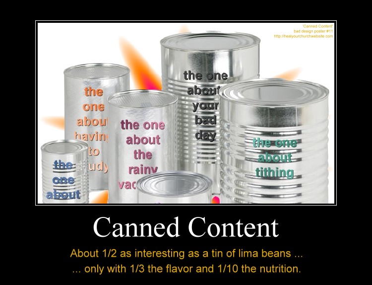
    Canned Content, about 1/2 as interesting as lima beans with 1/3 the taste and 1/10 the nutrition.

    Not that there’s anything wrong with terrific tools such as  Thesis, Headway, Genesis, and Builder; nor the premium themes one can purchase for them.

    Rather I’m hoping that along with the discussion of getting a fast start with premium framework themes and plugins that we also remember what usability guru Jakob Nielsen said about ‘Information Foraging‘ back in 2003 when describing how to catch and keep visits from data hungry first time visitors:

    The two main strategies are to make your content look like a nutritious meal and signal that it’s an easy catch. These strategies must be used in combination: users will leave if the content is good but hard to find, or if it’s easy to find but offers only empty calories.

    Basically, Nielsen is detailing how to attaining user-activity goals through the careful crafting compelling content and the navigation to it – known in the web strategy/analytics world as a ‘conversion funnel.

    So it is my hope that amid discussions on how to make our blogs look  ‘different like everyone else’ via various rendering engines, that we also take some time to talk about how-to develop a sensible information architecture that best suites the goals of your church and/or charity.

    Put another way, we need to remember that if  “Web users behave like wild beasts in the jungle …,” then we probably want to avoid taunting such ‘Informavores‘  with ‘canned content’  when in fact only raw meat will satisfy their hunger.

    In other words, just because a number of the speakers are justifiably and understandably using this conference as an opportunity to sell their template and plugin wares – it shouldn’t be to the exclusion of those in attendance whom are seeking help with all the other aspects that go along with establishing an effective web presence.

    Meanwhile, if you’re headed into town, let me know. If you can’t make the event, keep in mind that there’s a “SitePoint Podcast coming to WordCamp Raleigh.”

  • 12 Days of Jesus Junk – Day 4 – Unreadable at 11:23

    Even though I’m a software guy, I think if I were asked to design a religious-themed wall clock I might steer clear of some of the usability issues I find with the Jesus Christ Carrying Cross Christian Theme Wall Clock parodied below:

    12 Days of Jesus Junk - Day 4 - Unreadable at 11:23

    What usability issue? Well if I’m a user sitting across the room at 11:23, and possibly at 4:55 and 8:05, I might find it hard to see what time it is because of the dark black lines of the artwork create a dark black background for the thin black arms of the clock.

    So what has this got to do with my church or charity website? Glad you asked.

    What we want to take away from today’s example is the concept that part of a successful user interface isn’t just design that looks good (not that I find the clock artwork all that inspiring) — but also a design facilitates a positive and productive user experience.

    This can be measured in ‘conversion rates,’ that is the rate at which the user successfully uses the website (or clock) to accomplish some item of work or information gathering.

    This means we need to avoid design elements get in the way of a web page’s core functionality, otherwise we’re left with the antithesis of conversion – the user abandons the product – often quantified as the ‘bounce rate.

    To help avoid this common pitfall, I offer this “fast five” lists of things to remember when designing a webpage:

    1. You are not your user;
    2. solve their problems, don’t burden them yours;
    3. don’t assume all any of your users are idiots;
    4. engage in user testing – where non-geeks attempt simple, common tasks; and
    5. when a problem and/or encumbrance by a user is reported – do what it takes to provide the user a clear path to operational/work-flow success.

    On that last point, think Amazon.com, the premier example of conversion goals in action. When they hear of something that gets in the user’s way – even if it sounds stupid – they fix their site to accommodate the customer.

    I’d recommend doing the same, perhaps starting with some good-old-fashioned hallway testing and moving out from there.