Tag: church speak

  • 12 Days of Jesus Junk – Day 5 – Speak Clearly

    Even if you haven’t read the latest writings of Steve Krug, Jakob Nielsen or Luke Wroblewski, it doesn’t take a ‘Rocket Surgeon‘ understand the wisdom the “duck test” which according to the all-knowing Wikipedia asserts:

    If it looks like a duck, swims like a duck and quacks like a duck, then it probably is a duck.

    Which is why I find myself  a little bit confused when stumbled onto the  ‘Jesus Christ Celebriduck Limited Edition Collectible Rubber Duck‘ parodied in the instructional poster below:

    12 Days of Jesus Junk - Day 5 - Speak Clearly

    Call me old school but as I recall a rubber ducky is, as Ernie of Sesame Street so aptly described in song a “ .. little fella who’s Cute and yellow and chubby …

    Now I know what some of you are thinking “Dean, you dope, the Celebriduck is a collector item thing … of course it doesn’t look like a duck!” …

    … kidding aside, I already figured out it’s some niche merchandise marketed who also speak other arcane dialects such as “Beanie Baby” … but that gets to my point!

    Using insider jargon-eze is a sure fire way to relegate your website the non-desirable’ SEO’ known as ‘search-engine obscurity.

    Consider this:  in the U.S. 1 in 3 adults is unchurched. Meaning 1 in 3 adults don’t understand the ‘church-speak‘ that bables-up and out of expensive color brochures, sermon videos and web sites.

    So when it comes to the purpose and personality of your organization, speak clearly and say it plain. Tell visitors precisely what THEY seek in terms THEY understand.

    Put another way, by avoiding ‘clique chat‘  you’ll not only make your site more usable to individuals trying to find what you have to offer, but you’ll also help avoid spending $5k on a Search Engine Optimization (SEO) expert.
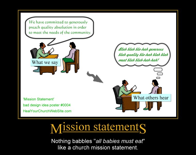

  • Bad church web design poster 0004 – Mission Statements (suck)

    Programmer guru Joel Spolsky reminds us that usability tests often demonstrate that very few users read the words you put on screen. Couple this the fact that 1-in-3 users are un-churched, and I’d venture to say that Nielsen is right – just about nobody reads nuthin’. Instead like wild animals, they just hunt it, scan it, and categorize it in their pretty little pumpkin heads and move on.

    Or as the good Dr. writes in his latest alert box entitled “Blah-Blah Text: Keep, Cut, or Kill?“:

    Introductory text on Web pages is usually too long, so users skip it. But short intros can increase usability by explaining the remaining content’s purpose.

    Which all leads me to yet another addition to our growing gallery of bad church website design posters, this one entitled “Mission Statements:”

    For those of you who didn’t figure out that clicking on the thumbnail above gets you to ‘the big picture,’ – this poster basically preaches a lesson shouted from the mountain tops by Father Flanders that asserts:

    “[Mission statements] should be abolished because every Mission Statement ever written can be summarized in four words — ‘All babies must eat.’”— Vincent Flanders, author of Son of Web Pages that Suck

    Or to paraphrase Coding Horrors’ Jeff Atwood – replacing the term user and software to our advantage:

    My intent is not to make fun of [church goers and/or seekers], but to illustrate that there are far more effective ways to communicate with your dog. Essentially, any time you’re asking [a visitor of your church website] to make a choice they don’t care about, you have failed the [visitor]. Well designed [church websites] takes care of “[Christianese or church-speak ]” all by itself, and leaves the [seeker] free to worry about things relevant to the [information they seek].

    And for you fans of Gary Larson’s Far Side who recognize the inspiration for my poster, Mr. Atwood also has in the same article I just mis-quoted, an example of “what we say to dogs … vs … what they hear.

    Once again, as a living reminder of not-so-intuitive design, you click on the small poster to see the full-sized version, but please, no hot-linking without providing a link back here to the article – not just the pix.